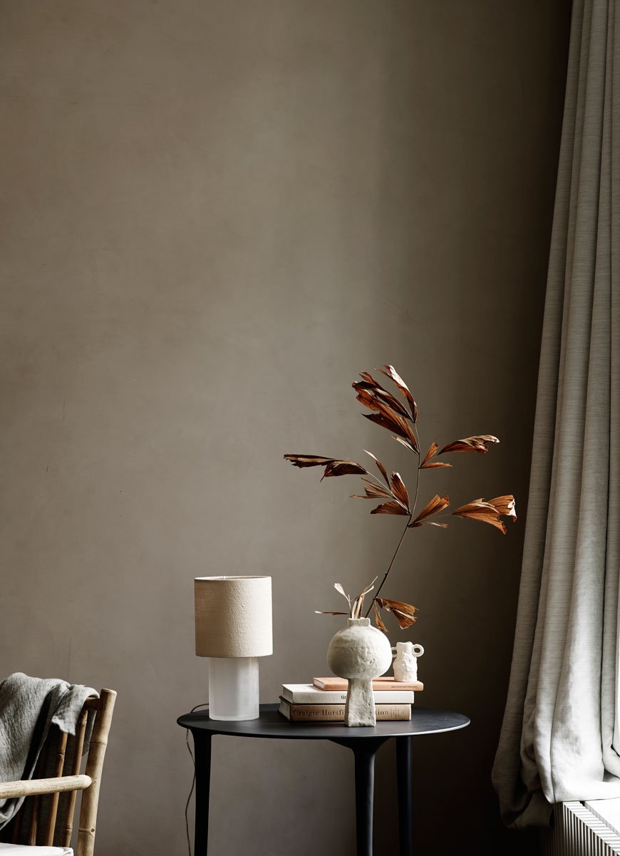
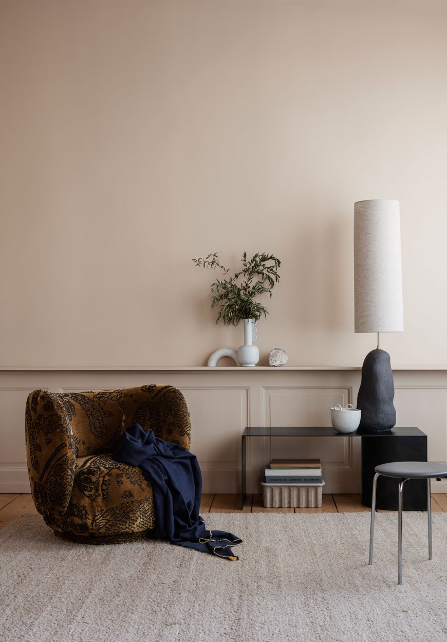
The Lockdown Get-Down: An Uplifting Playlist to Boost Your Mood

These are unprecedented times. As I sit here typing in the sunroom, looking out at the garden now drenched in the early spring sun, for a minute I could almost imagine this was any other normal working day. And yet.
As the world struggles to cope, adjust and shift tactics as it fights Covid-19 over the coming months, we have to learn, to some extent, to let go of what we can't control.
The effects of this virus are far-reaching, not just to those directly affected but for businesses, employment, schools, social gatherings and beyond. But as daunting and restrictive as isolation feels, there's a huge amount of freedom to be found in it. How often do we imagine a time where we can stay at home and just be with our families? How often do we wish we had time to work on ourselves, learn something new, practise a skill or finish that book? Somehow, all that unnecessary daily noise and busyness falls away and reminds you of what really matters.
So, with that in mind, I want to keep the space here on Curate and Display a positive one. There will always be Nordic and contemporary interiors to keep you inspired. There will always be little postcards from our home and garden (even if my attentions are pulled away to keep the kids entertained from time to time).
And because I believe in the positive effects of music and the ability it has to improve your well-being and lift you out of a difficult headspace, I've created a new and uplifting playlist on Spotify. The Lockdown Get-Down is filled with two hours of high energy grooves to get you through the day. And if you're looking for something slightly calmer, you can explore my Slow Sounds Playlist series.
Push back the furniture, turn up your speaker and get down with your bad selves.
My door is always open. Feel free to comment, email or connect over on Instagram, Twitter or Facebook. Take care. See you soon.
Tiff x
New Menu Connected Spaces Designs for 2020

Following the launch of The Audo in Copenhagen last year, this multi-functional hotel residence and home to MENU headquarters has become an ever-evolving, living space in which the Danish design company develops and interacts with its collection.
I'm always excited to see what MENU will do next, their approach to refined, minimalist furniture is always so intuitive. Everything they release I instantly fall in love with. Sigh.
The new MENU Connected Spaces additions for 2020 reflect an ethos rooted in the idea of meaningful interactions within our living environment. As The Audo so beautifully demonstrates, the distinctions between home, work, and hospitality are blurring. These common, age-old constraints are being redefined.
We want our workspaces to feel more homely whether we work from home or not. We want for our homes to feel more like an extension of a boutique hotel. To make the everyday experience at home feel that little bit more special, to create meaningful interactions within the spaces we live in.
Anyway, let's stop with the gushing and get on with introducing the new pieces, shall we?!
Reverse Lamp - by Aleksandar Lazic

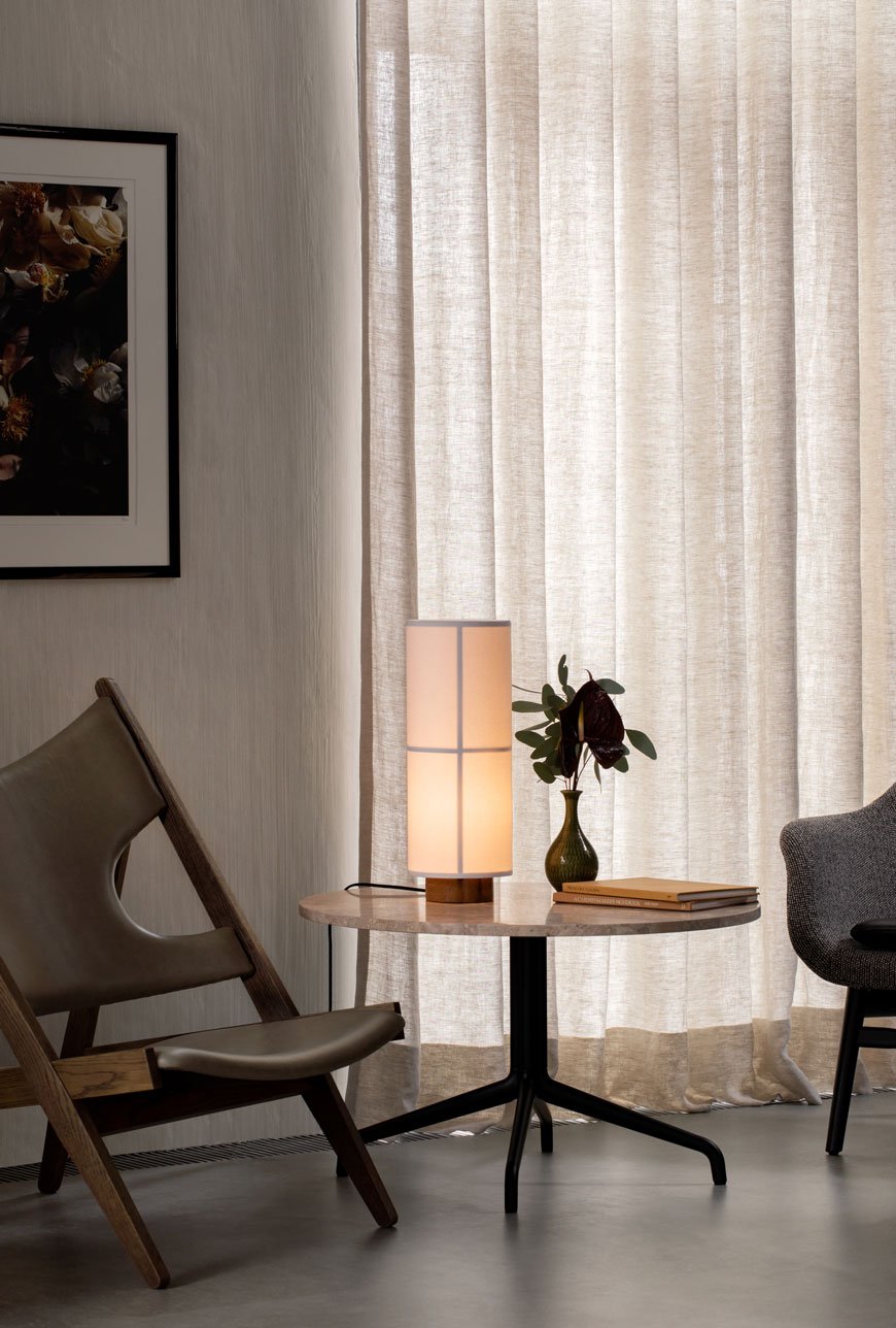
The real stand-out piece from the 2020 Stockholm Design Week (I missed it) was the Reverse Lamp, designed by Aleksandar Lazic. The base of the lamp features a raw travertine stone which reflects the light from the conical, bronzed aluminium shade across its unique and unworked surface. The lamp is fitted with a dim-to-warm LED light to adjust its intensity and is an ideal source of ambient light for the bedroom or shelving unit.

Hashira Collection - by Norm Architects

A soft glowing linen covered Japanese inspired Hashira pendant lamp, designed by Norm Architects hangs over the oak Androgyne table, part of the MENU Connected Spaces for 2020 collection.
Norm Architects continue to explore the intersection of Japanese design and Nordic sensibilities with the Hashira lighting collection. Taking its name from the Japanese word for column or pillar, this linen cloth take on the traditional rice paper lamps emits a warm and soothing glow. Available in a floor lamp, table lamp and variations of pendant lighting, its soft and simplistic design show the structure inside when lit.
Walker Wall/Ceiling Light - Søren Rose Studio

I absolutely adored seeing the Walker lights in situ when I visited The Audo. Inspired by the golden era of design, their almost vintage 1930s appearance gives a very contemporary space a touch of old-world elegance. Designer by Søren Rose spent time traveling across the US searching for old lamps and retro parts that would go on to inform the Menu Tribeca collection. The opal glass or metal scones can be configured accordingly to be wall-mounted facing up or down as well as used as a ceiling light.

Androgyne Dining Table - by Danielle Siggerud

An update on the Androgyne side table designed by architect-designer Danielle Siggerund, the new Androgyne dining table features a Kunis Breccia mixed stone table top, polished to a high shine on top of a sculptural oak base.
Initially designed by architect-designer Danielle Sigerrund as a side table, Androgyne has since evolved to include a lounge and dining table. Drawing on the monument-like qualities of the side table, the latest iteration features a striking Kunis Breccia stone surface atop a natural oak base. This blend of different warm-toned stone gives the table a soft feminine feel against its polished and masculine shape. Quite the statement.

Rail Desk - by Keiji Ashizawa Design

A super minimal, slender light oak topped wall-mounted desk with a black metal support arm. Designed by Keiji Ashizawa for MENU, this multifunctional piece of furniture becomes adaptable as a small space workspace, shelf or counter top.
The Rail Desk is the perfect example of how design is adapting as the way we use our homes becomes more fluid and flexible. This slender, minimal desk created by Keiji Ashizawa Design, demonstrates how multi-functional furniture can be used to create adaptable spaces. Inspired by architectural structures and his background in steelworking, Keiji's Rail Desk with an oak top can be used as a home workspace (ideal for small space living) as well as a shelf or counter.
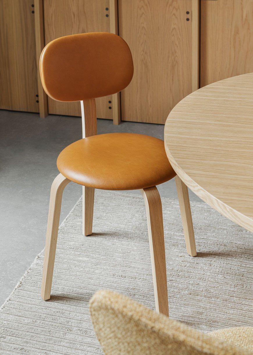
Afteroom Plus Wood Base Chair - by Afteroom

An update on MENU's first dining chair, the Afteroom chair, the latest addition has been created in plywood which gives the chair a soft, curved aesthetic.
A hands-down favourite of mine as a dining chair, the original tubular metal incarnation of the Afteroom chair pays homage to the stripped-back functionality and shape that arose from the Bauhaus movement. Designed by Stockholm-based Taiwanese duo of the same name has been given an update in plywood. Its gentle curves and soft silhouette make this chair a warm and versatile addition to the home.
MENU Connected SpacesPhotography courtesy of Menu.

Laurie Poast Atelier Minimal Sculptural Ceramics

I have some utterly beautiful work to share with you today by American-Scandinavian ceramist Laurie Poast. It's been impossible to keep my eyes off her collection of minimal, sculptural ceramics ever since I first saw her work on Vogesparis.
Now based in Bergen, Norway, Laurie grew up in Wisconsin. Her father is a master Luthier, maker of Norwegian Hardanger fiddles, so it's inevitable that a deep connection to craftsmanship would influence her.

With a collection spanning sculptural art, bowls and vases and hardware for interiors, it's almost impossible not to want to reach out and touch, such is the tactile, smooth quality of the objects she makes.


Laurie's work is intrinsically organic, from the silky, raw matt ceramics she casts her shapes in, to the earthy and natural tones they take on. Rich autumnal inspired colour palettes connect to nature whilst chalky textured black and porcelain white looks to a more contemporary aesthetic. With an approach to curate moments of pleasure, calm and delight, her pieces take on a life of their own in the way they play with light, casting deeply textured shadows between the ripples, curves and architectural scoops.


If you're looking for a select pieces of art to adorn a shelf at home, the Laurie Poast Atelier collection is an easy choice to make.
As a self-confessed lover of ceramics, there isn't one piece I wouldn't love to own, though a personal favourite are the Valet bowls (below). Useful objects of beauty and completely stunning on their own. The urge to sit and stroke them all day might prove too much!


Follow Laurie's Instagram for more of her delicate work.
Photography courtesy of Laurie Poast Atelier, with thanks.
[AD] Heal's Sustainable Edit Brings Spring with LSA Canopy Collection
[Advertisement - select pieces from the LSA Canopy collection have been gifted by Heal's as part of their 'Recycle Remade' campaign.]
In the last week, I've noticed the garden start to come out of hibernation. That subtle glimpse of the promise of spring. And goodness knows we are READY for it. YES! So when my good friends at Heal's asked if I'd like to style select pieces from the LSA Canopy collection as part of their 2020 Sustainable Edit, it was an easy yes.

This year more than ever, Heal's are carrying the responsibility towards caring for the environment by championing products that are produced with recycled materials. Launching their full Sustainable Edit in March, their 'Recycle Remade' homeware range features the iF Design Award 2019 winning LSA Canopy collection.
Known for their glassware LSA have designed this collection in collaboration with the Eden Project, centred around the concept of propagation and hydration. Made from 100% recycled glass and sustainable cork, Canopy has a really fine feel to it. The glass is quite thin with occasional air bubbles, adding to the wabi-sabi, recycled appeal. Featuring low and tall vases and bulb planters, self-watering planters and terrariums, Canopy encourages the use of self-sufficient gardening, perfect for bringing nature into the home.
Canopy Vase / Bulb Planter, from £18.00
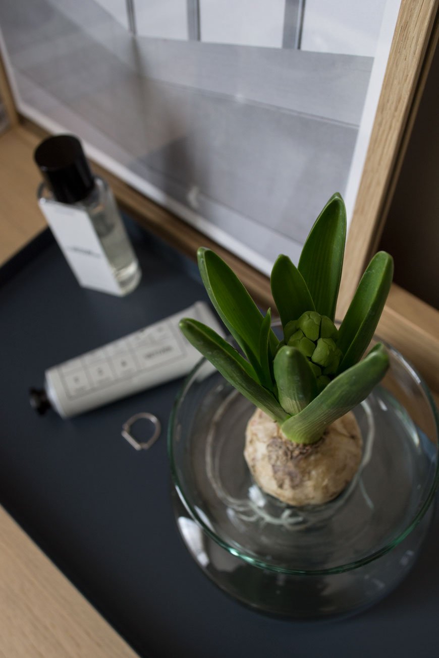
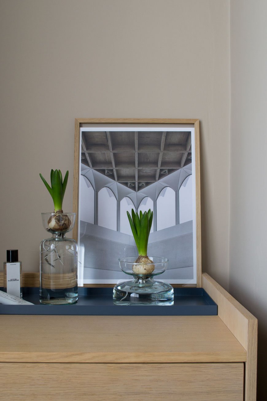
It's impossible to resist the heady fragrance of Hyacinths this time of year. I like to keep a potted cluster of bulbs in the house when I remember to pick some up from the garden centre. I've styled a couple of bulbs on our Morten chest of drawers in our bedroom (also from Heal's) which will bloom white in a few days. You can leave most of the soil around the root ball if you like but I've rinsed most of it away, threading the longers roots into the bottom of the vase.
Canopy Self-Watering Planter, from £36.00
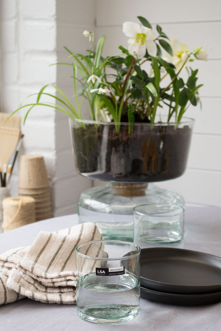
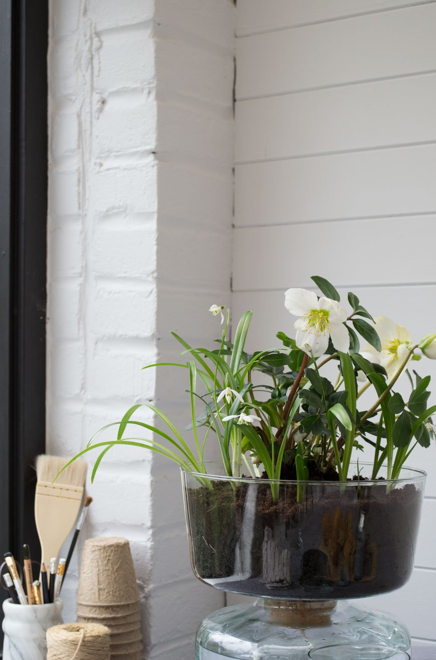
Another spring favourite of mine is the evergreen Hellebore or 'Christmas rose'. It has a long flowering period over winter, brightening up the border when other flowering plants are dormant. I've got them in the sunroom now, sitting in the self-watering planter. A clever hydration system made of two parts, a piece of rope connects the soil-filled planter on top to the water well beneath allowing the plant to draw up moisture as it needs it.
Every part of this collection has been considered, right down to the minimal packaging, made from recycled card and printed with organic vegetable ink.
Canopy Closed Garden, £40.00
Inspired by the shape of the Biomes at the Eden Project, I used the Closed Garden to create a humid space for small spider plants and maidenhair ferns. Using a thin layer of gravel for drainage, I added a layer of sphagnum moss to help retain moisture before topping it with a good layer of houseplant compost. Once I'd pruned and planted everything in, a good spritz of water before closing the lid would provide the plants with the right level of humidity, light and temperature in their final spot in the sunroom. I'm excited to see them thrive in the coming months!
Photography and Styling © Tiffany Grant-Riley.
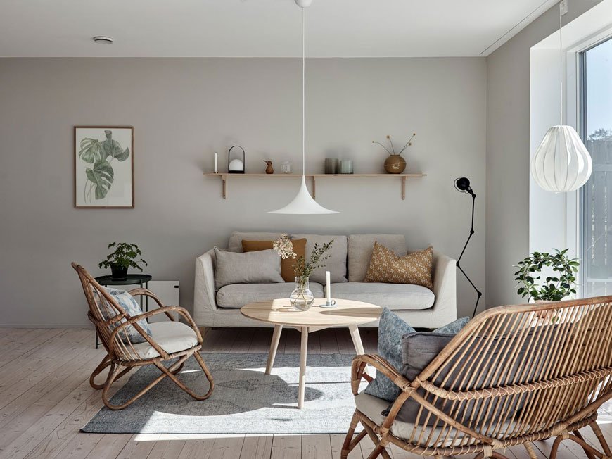
Swedish Island Living In An Architect Designed Family Home
Glancing out the window at my rain and wind lashed garden, I'm already thinking ahead to spring and its promise of warm sun. For now, images of this light-filled Swedish villa are just as good a substitute.
And there's so much inspiration to take away from this architect-designed family home. Nestled into the rugged landscape on the island of Brännö in the southern Gothenburg Archipelago, its Gotland pine-clad structure is a lesson in open plan living done well. It makes the most of every square inch, crucial when you're planning your own extension or complete new build.
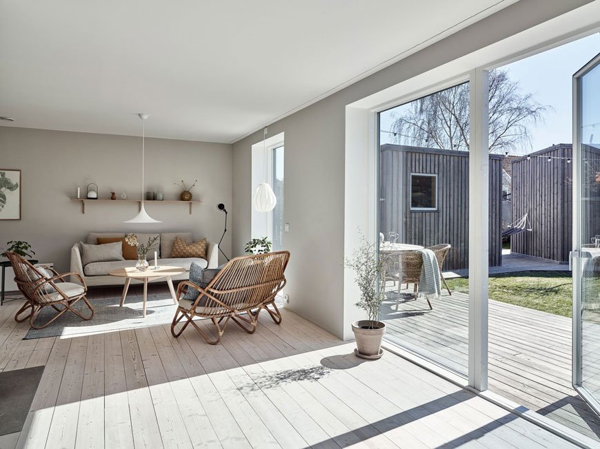
Built-in an L-shape to protect against the wind, this home looks out across the water and garden dotted with lilac, apple and cherry trees. Just a stone's throw from the city by boat, there are no cars allowed on Bränno. The pace of life is altogether slower here, connected to the rhythm of the island's diverse surroundings of meadow, forest and beach. What blissful seclusion.
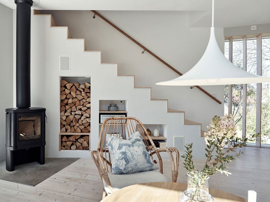
Inside, the interiors connect beautifully to the garden. Light spills into the open plan living spaces through ceiling to floor windows. You're always in touch with the heather covered rocks and the view across the water. Tinted and white oiled pine boards run across both floors, continuing a sense of space and the soft grey walls help tone down the direct sunlight.
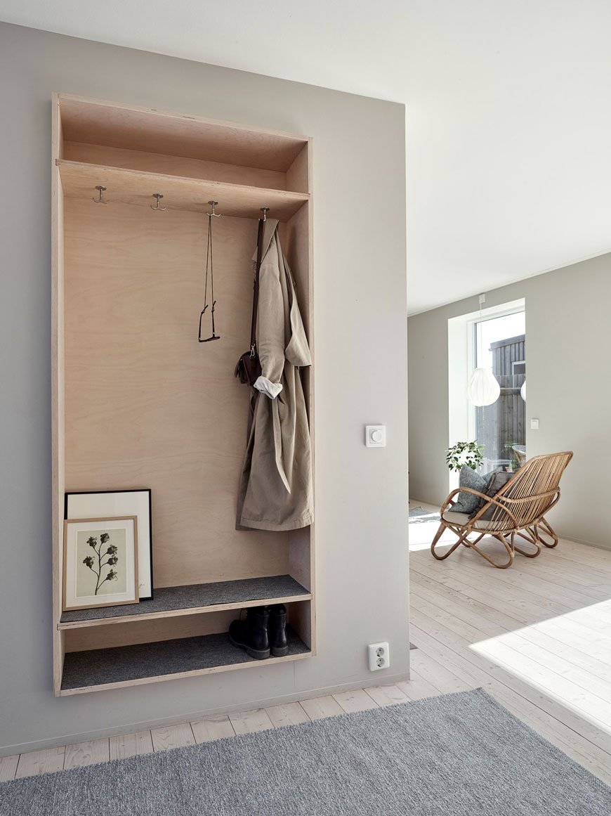
I love this simple open plywood cupboard that cleverly zones the entryway. Wall mounting it off the floor maintains a feeling of space and gives this area functionality.
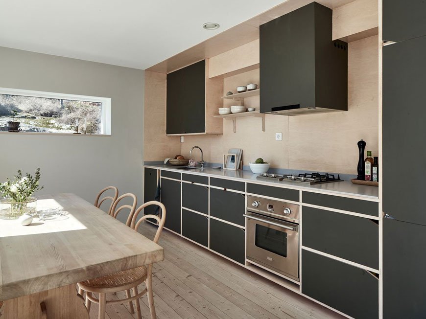
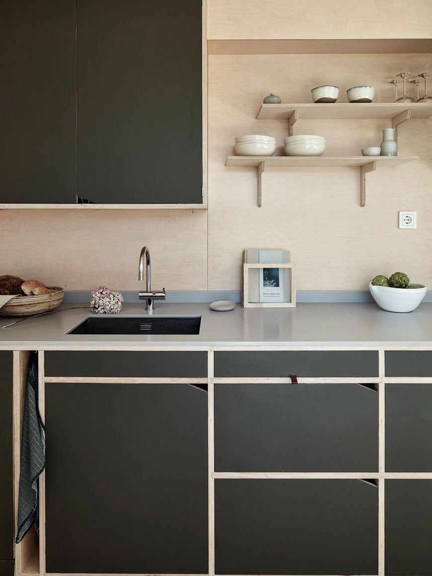
The kitchen is wonderful. Oh, the kitchen. Set across one wall it's typically Scandinavian, doubling up as a dining space with a warm wooden table and classic cane bentwood chairs in the centre. Built from humble plywood, as you'll see much of the upper floor is too, the cupboards have been painted dark green with notches cut out for minimal door pulls. Small, open and perfectly formed.
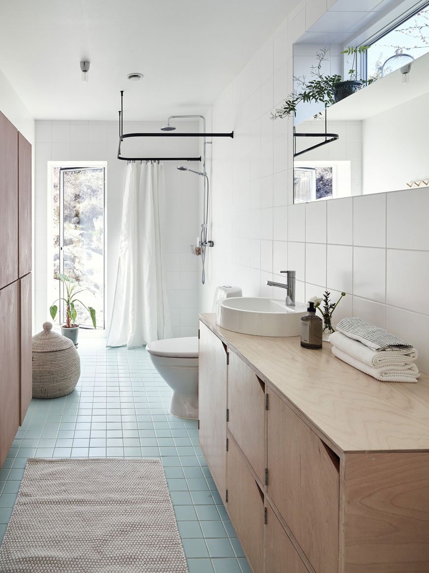
Square turquoise floor tiles add a subtle splash of colour in the bathroom. So as not to interrupt the space with a solid shower unit, the owners have used a simple black hanging rail to zone the shower area with recessed drainage under the floor. Plywood continues in the cupboard storage with the vanity matching the same style doors as the kitchen.
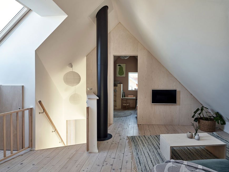
Upstairs, the master bedroom and kids' room peel off from a cosy snug where the use of plywood continues on two sides of the room, marking the shape of the roof.
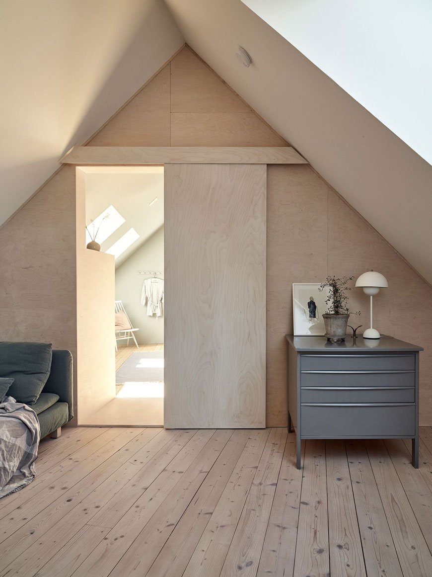
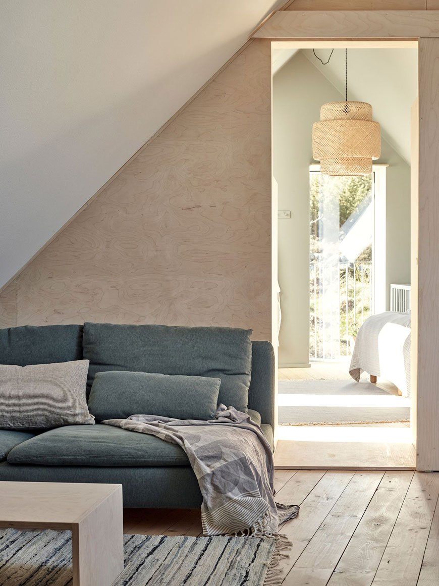
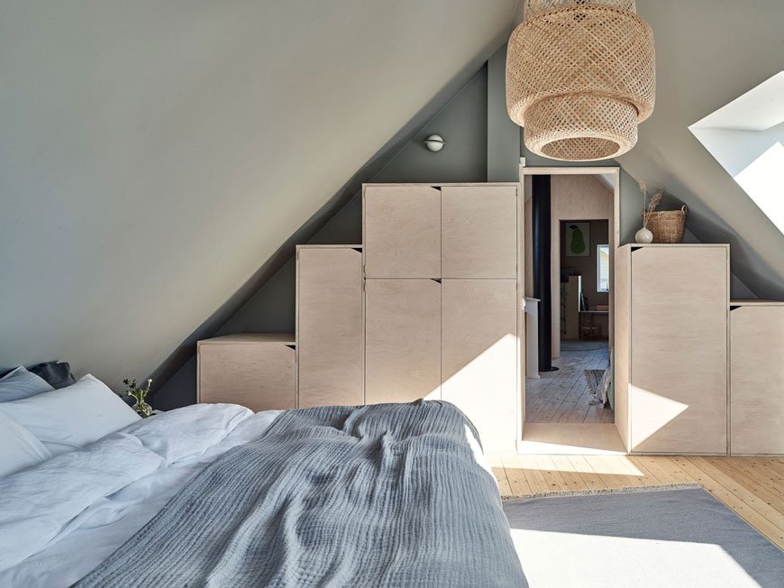
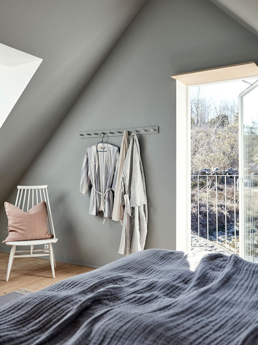
The master bedroom, painted in a soothing shade of Pale Linden by Jotun Lady is bathed in warm light via skylight windows and a glass door, leading out onto a balcony. The owners have tried to retain as much floor space as possible with built-in plywood storage tapering up into the eaves of the roof space.
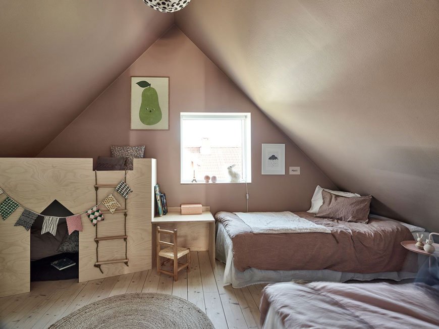
This sweet and soothing kids room has been painted on both and walls and ceiling in Jotun Lady Senses. I love how cosy it feels in here with the built-in playhouse and desk making the most of the light from the window above. Most of all, it's been decorated in a way that's easy to adapt as the kids grow older.
Photography courtesy of Kvarteret Mäkleri.
[AD] Subtle Festive Style - Georg Jensen's Christmas Collectibles 2019
[Advertisment - this Nordic Christmas inspiration post has been styled with the help of Georg Jensen's Christmas Collectibles 2019]
Can you believe Christmas is less than a month away? Don’t know why I’m surprised, it comes every year yet I’m always completely in denial about it!
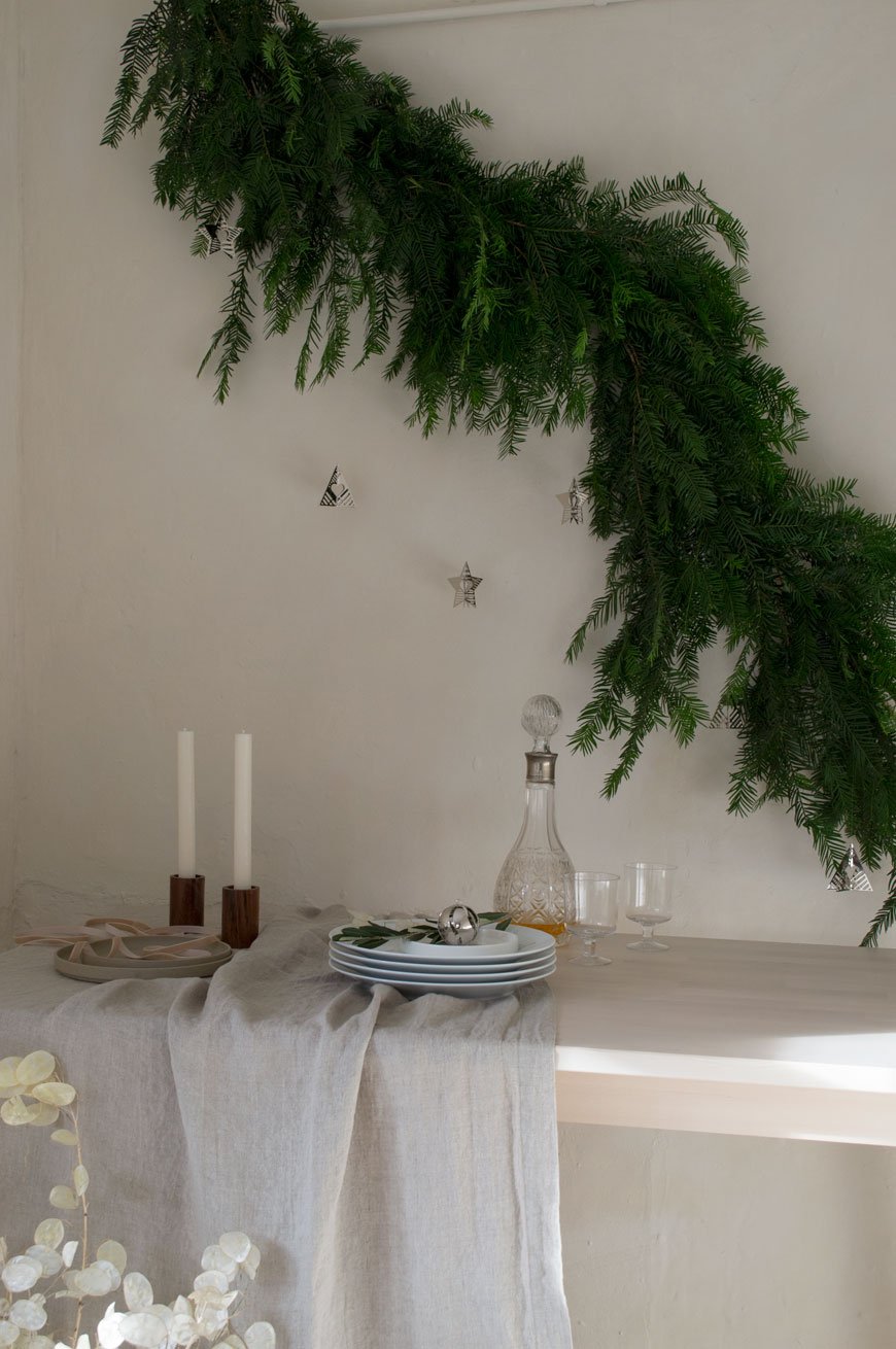
We like to celebrate a minimal Christmas here though, so there's not a huge amount of planning to do. The decorations go up a week before the big day and I love to decorate our home with a subtle Nordic feel. You know me, I love muted colours, nothing garish and over the top. Things like simple, delicate touches of greenery hung about the house. I'll bring in bunches of olive and scented bay tree cuttings from the garden and mix them up with pine tree clippings from the florist.
Most of our Christmas decorations are wooden too - I've learnt this lesson from childhood as all three of us gradually decimated mum's collection of delicate, glass baubles!
I do think tradition is really important though. There are decorations we bring out every year and the kids have come to know and love. I'm always neurotic about the tree which we start decorating with the kids and I do again when they've gone to bed! We bake gingerbread and Ricciarelli, Italian almond biscuits, together and on Christmas Eve I made a rich and creamy walnut pasta. The little things that mark the season make it feel special.

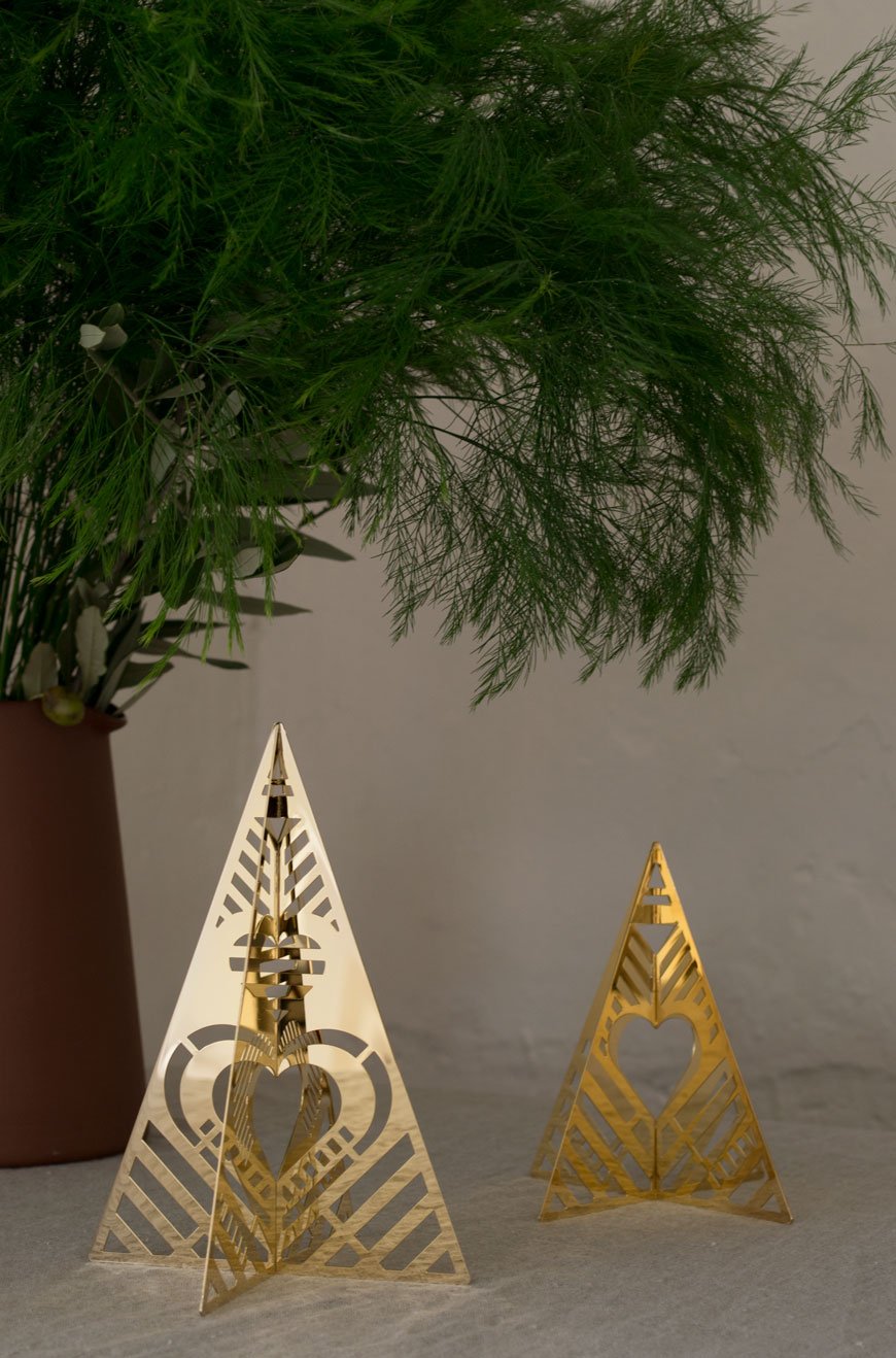
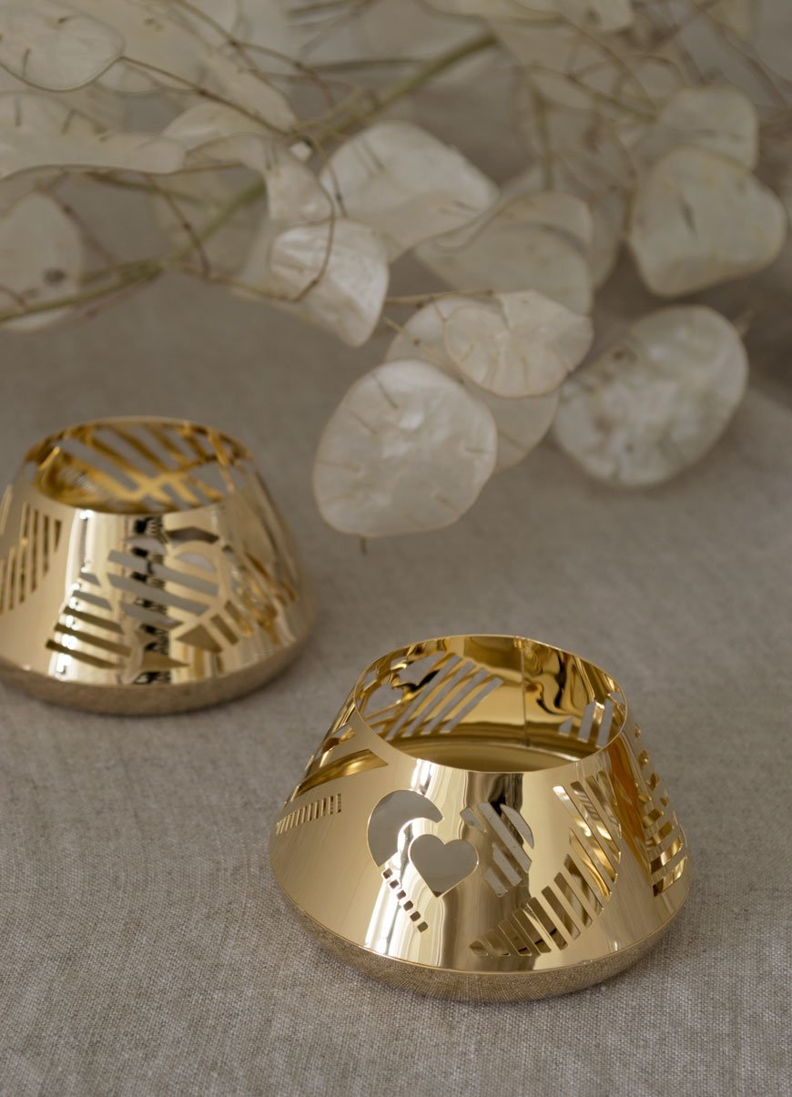
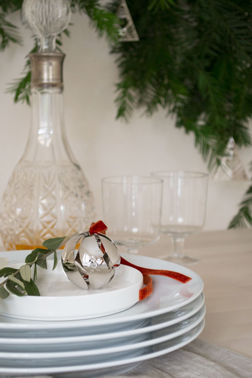
This year I'm giving my festive styling a lift with Georg Jensen's Christmas Collectibles for 2019. Their high shine Palladium and Gold plate bring about a reflective quality that catches the light beautifully. I love the way they cast strong patterned shadows in the winter light.

As part of their own tradition, Georg Jensen releases an annual collection of decorations every year. Each comes in its own presentation box and compliments the previous years' collections, all handcrafted in Denmark. Designed by Sanne Lund Traberg, this timeless collection focuses on love, togetherness and tradition.
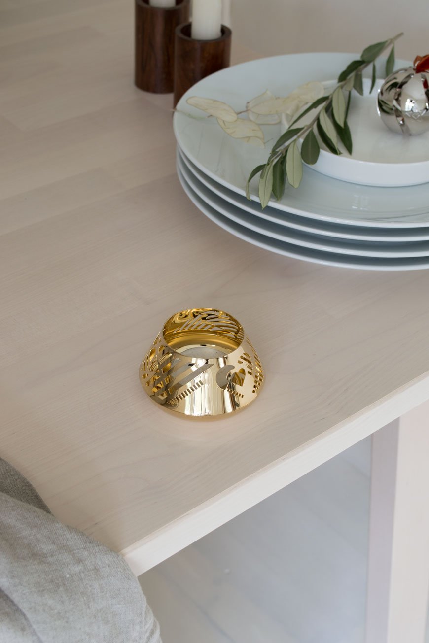
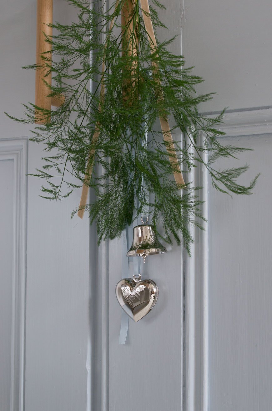
With a strong connection to Georg Jensen's relationship with modernist design, the collection displays elements of geometric Cubist shape and Art Deco style. Centred around three simple heart, star and tree motifs, this collection feels fresh and contemporary. Warm up the table with a set of gold plated heart tea lights and striking Christmas trees as a centrepiece. Or, stick to cooler tones with the palladium (which I prefer).
This is such a versatile collection and there are endless ways to style them. The ornaments make sweet little gift or napkin decorations if you don't want to hang them from the tree. Speaking of which, the jury is out as to whether we get another one this year. With the best of intentions, we tried a potted fir last year but I was far too late to re-pot it at the end of the season. In the end, I had to watch it slowly die from the kitchen window. Oh, the agony! I think perhaps fir trees aren’t my forte!
I like to set the table with a crisp white cotton or natural linen tablecloth - it provides a strong base for styling the rest of the table. Using velvet ribbon in soft, neutral tones adds understated luxury to the table when tied around the napkins. I've also used it hang some of the ornaments, though they come with red or ice blue ribbon.
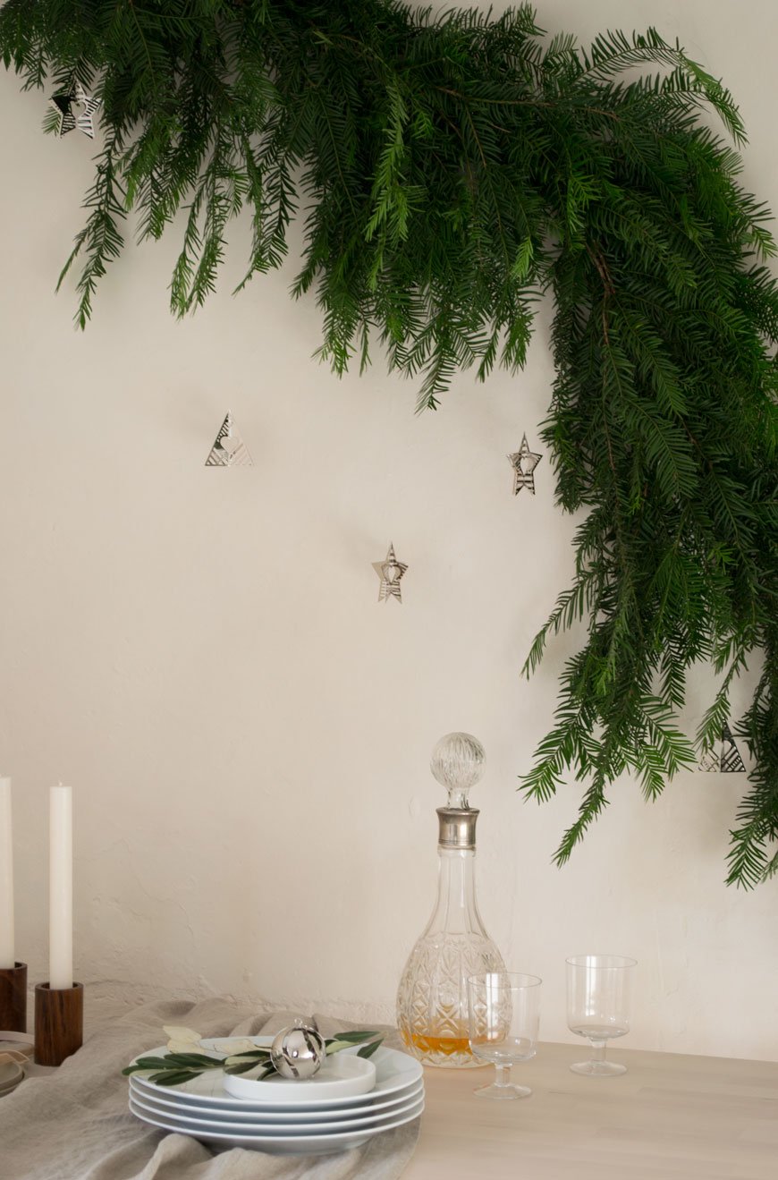
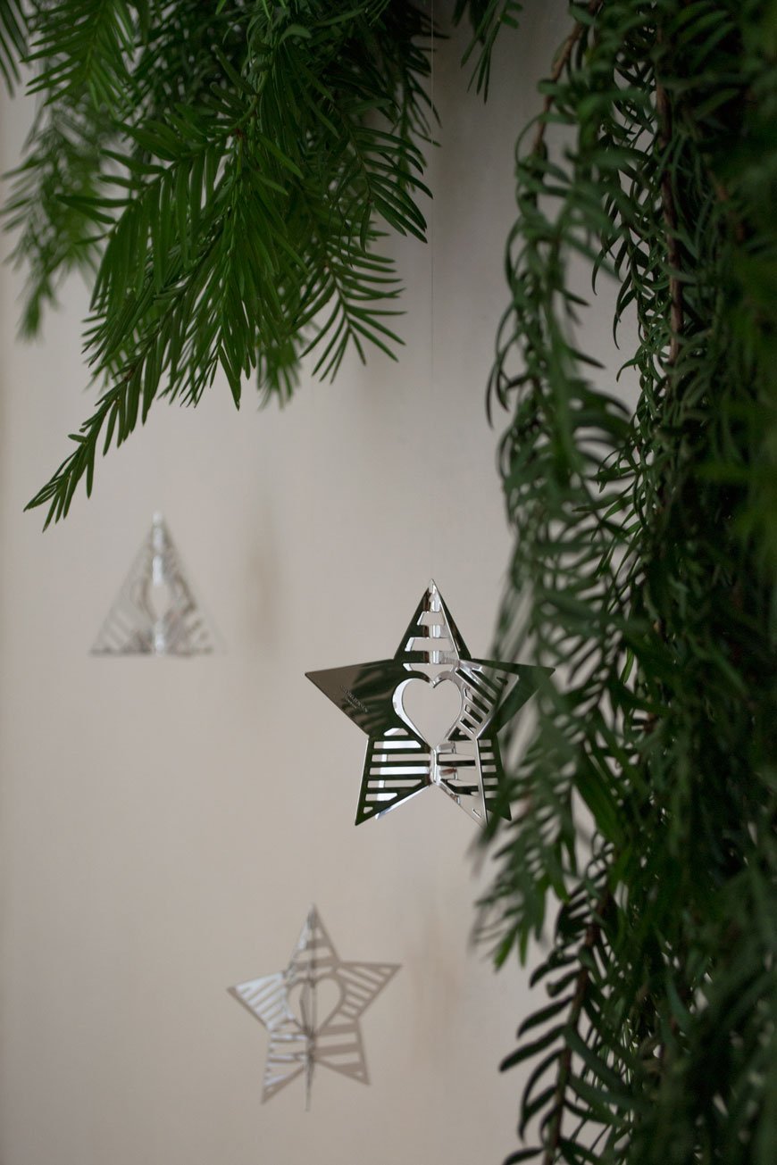
As an alternative to the Christmas tree, I've made a simple yew tree garland and hung a selection of the Palladian Star and Tree ornaments for a bit of sparkle. I might even make a few more to have in our living room in place of a tree. You can make a feature of it like I have, suspending it with invisible thread across the wall or wrap it around your bannisters on the stairs. They're so easy to make and once you've got the basic concept down you can make them from anything you like.
How To Make A Festive Yew Tree Christmas Garland
You will need:
- Thin, natural rope the width of the space you're decorating with extra at each end for attaching.
- Thin florist's wire for wrapping.
- A good shopping bag's worth of greenery from your florist (or foraged carefully and considerately).
- Scissors for trimming.
I prefer to hang one end of mine up high and stand on a chair to make mine, but you can lie it flat on a table if you like.
Make small bunches of greenery, tieing each securely with the wire.
Starting at the top of the rope with the tip of the leaves facing down, wrap the first bunch with the wire. Place the second bunch a few centimetres underneath the first so that they overlap and tie it with the wire to hide the mechanics under the first bunch. Continue until you reach the end of the rope, overlapping each time.
If you're hanging the swag across a doorway or wall, you may want to secure some of the bunches with more wire to get them to sit the way you want them to.
To suspend it across the wall, use some really strong, fine thread. Loop it around the garland and pin it discretely into the wall. You might need another set of hands to support the weight...and your own sanity. And that's it, you're set for the season!
If you'd like to explore more of Georg Jensen's Christmas Collectibles, take a look at their website. And for inspiration on entertaining with Georg Jensen, check out my styling of the Bernadotte and brand new Helix collection.
Photography and styling © Tiffany Grant-Riley
![[AD] How To Decorate With Limewash Paint - Breathable Eco Paint From Bauwerk Colour](https://images.squarespace-cdn.com/content/v1/63c93d56b8f27c4ca17f2ed3/1682502107222-V774E98QC55YCZE8SOMK/how_to_use_limewash_paint_bauwerk.jpg)
[AD] How To Decorate With Limewash Paint - Breathable Eco Paint From Bauwerk Colour

[Advertisement - this guide on how to use limewash paint was made in partnership with Bauwerk Colour who supplied the product for this post].
It's been a while since I've had new work on the house to show you, hasn't it? I know, progress has been frustratingly slow since we stripped the hallway in January. January! But, me being me and not wanting to sit idle over summer, I decided to give my workspace an update.

This room was originally the scullery when the house was built in 1904. Sandwiched between the kitchen and sunroom at the back of the house, it can feel a bit like a tunnel. Although it gets fabulous light from the South-West facing garden, when there's no sun, it's pretty miserable, not to mention bloody cold. The walls are extremely rough and, to embrace that old plaster texture, I wanted to use a natural paint that would accentuate it. After my trip to Copenhagen in May piqued my fascination with textured lime wash walls (it was everywhere), I knew this would be the perfect opportunity to road-test it!
Enter Bauwerk Colour, an Australian brand that began creating modern lime paint for interiors and exteriors almost twenty years ago. With a vast selection of colours inspired by nature, many produced in collaboration with world-renowned interior stylists, it was a complete no-brainer for me. Curious? Let's dive in a little deeper, shall we?
A brief history of limewash paint.
Historically, limewash has been around for centuries. As one of the very first around, it's a natural, environmentally safe paint. The paint is made when crushed limestone is burnt and 'slaked' (combined) with water to form a putty. This putty is aged, diluted with water and mineral pigment for colour and voila, we have limewash. A breathable paint which allows moisture to escape, it cures by taking carbon dioxide from the air as it dries. During this process, it forms calcium carbonate crystals as it hardens which gives it a unique luminosity when the light hits.

The colour of choice - 'Mykonos' gives a warm feel in winter and a holiday feel in summer.
What's the appeal of lime paint?
At the time our house was built, and indeed even earlier, natural paint solutions were being pushed out for newer, chemically-based paints. Think lead, turps and formaldehyde that strengthed the durability and finish of the paint. Today, awareness and attitudes towards the harmful effects such chemicals can have on the environment encourage us to look for natural alternatives when decorating our homes.

Painting round the pipes was tricky business but the paint stuck well thanks to the undercoat.
Without a doubt, the biggest argument in favour of this paint is its low impact on the environment. As it contains zero VOCs (volatile organic compounds that release vapours and gases over time) you can use it with a clear conscience. It's water-based and there are no strong odours to contend with. Though there definitely is a smell of some description, it disappears eventually.
If you love the look of unpainted plaster walls like these from our bedroom renovations, you'll love how easy it is to recreate that look without calling out the plasterer. It's ideal for older houses, particularly those which still bear the original horsehair plaster walls and need a little extra care. That expressive, almost cloudy texture can lend depth and character to newer properties too. I absolutely love the way it picks up the nuances of light throughout the day and the bolder you are with the brush strokes, the better!

My choice of 'Mykonos' from the Holiday collection, in the bucket and ready to go.
It looks great, but are there any downsides to it?
You'd be hard pushed to find any cons to using limewash, however, it's worth considering that it's not a wipable paint. If your walls pick up any wear and tear over time, you'll need to apply another coat.
There's an element of risk with limewash paint, so if you're not prepared to go with the flow, it might not be for you. By nature the finished look will depend on the surface you're painting onto and how well its been prepared beforehand, as well as how you apply it. You might also discover that you need to apply more than the recommended number of coats to get the required effect.

Limewash before and after I started the first coat on the back wall.
How to master the limewash paint technique
Before you order, check you're using the right product for the type of wall you're painting onto. I recommend using the appropriate brushes too. Don't use a roller! I used the 'block short' for smoother areas and the 'medium short' for brick and render.
First ensure that the surface you're painting is clean, dust-free and has a good, solid coat of undercoat or paint underneath. Bauwerk recommends an acrylic undercoat. Sometimes the lime paint can show up the differences of the structure in your wall - areas where the plaster has been patched with filler for example, so the undercoat will provide a solid base and avoiding ghosting.

Neutral, earthy tones styled using paint swatches, linen board and textured paper in a moodboard.
Unlike standard emulsion paint, limewash has the consistency of milk. The intensity of the colour is built up over several thin coats which are absorbed into the wall rather than sitting on top of it.
Some products come as a dry powder and require mixing with water but Bauwerk lime paint comes pre-mixed in recyclable pots from 250ml up to 10L. First, stir or whisk the pot up to mix any sediment and decant all of the paint into a bucket.
Working the limewash across the wall in a criss-cross action with a short, natural bristled paint brush.
Applying the second coat of limewash to the walls with criss-cross brush strokes
Dip the brush into the paint and flick off the excess to avoid drips. Starting in one corner and work your way into the centre of the wall using a criss-cross movement. You can be quite expressive with this. Keeping a wet edge as you go to avoid colour overlays, continue applying a thin coat to the walls. Repeat the process from each corner until you meet in the middle and then move on to the next wall.
Be prepared to work fast! I found that the limewash started drying pretty quickly, so it kept me on my toes to maintain a wet edge.
To build on that cloudy look, start subsequent coats in a different corner or in the centre and work your way outwards. Bauwerk has some brilliant 'how to' videos which demonstrate the technique a darn sight better than I can describe them!

So what's the verdict?
Let's just say, I think it's love. Mykonos was 100% the right choice. The room is still empty but I often find myself standing in the doorway, watching the walls catch the light.
I'll be the first to admit I was a little nervous before painting started. This was new territory for me and I don't like not knowing what to expect at the best of times. I think the best approach is to trust the process. I used this as a mantra until the second coat had dried and I could see the room taking shape. I took around ten days to apply three coats, allowing a few days in between for each to dry. Would I use it again? Absolutely yes.
If you found my tips on how to use limewash paint useful, check out my 'Decorate With Lime Paint' Pinterest board for inspiration.
Photography and styling © Tiffany Grant-Riley
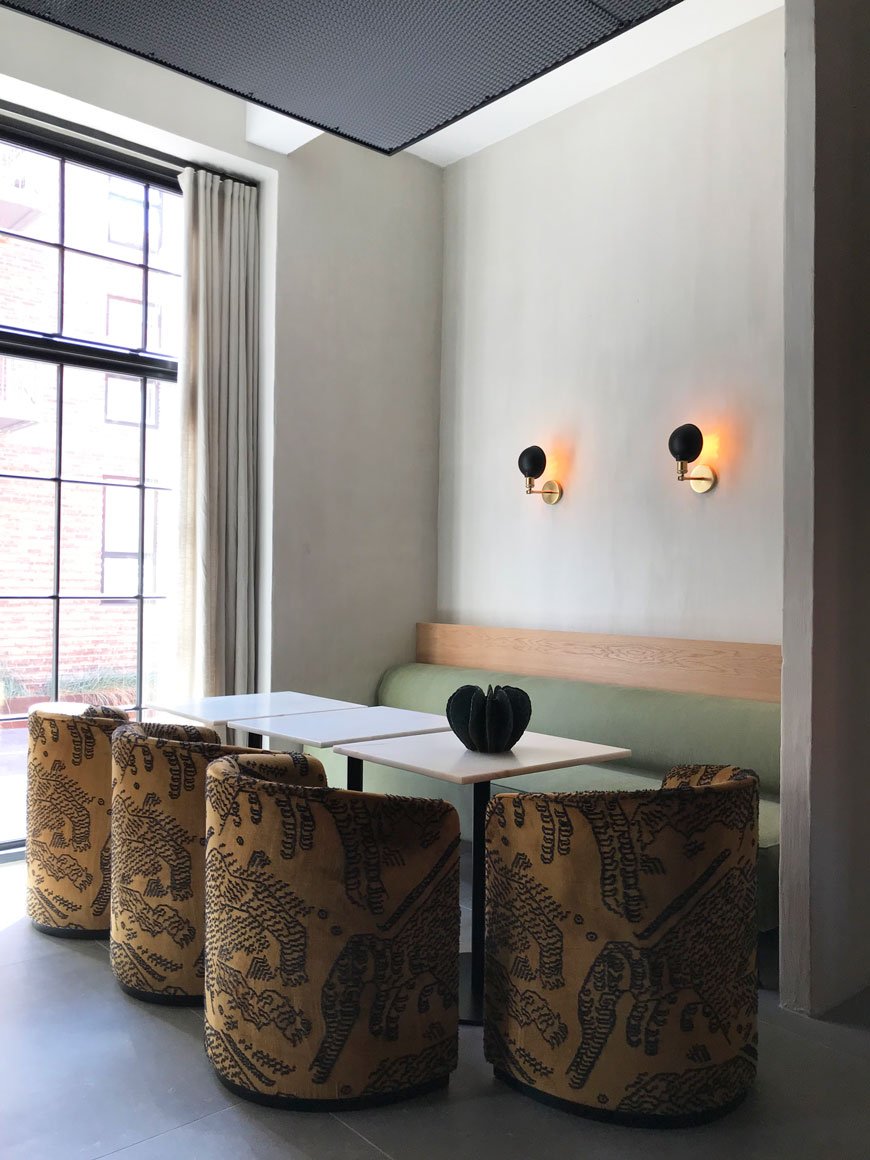
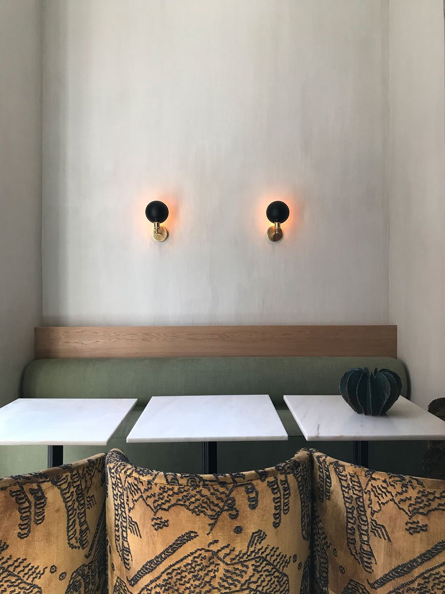
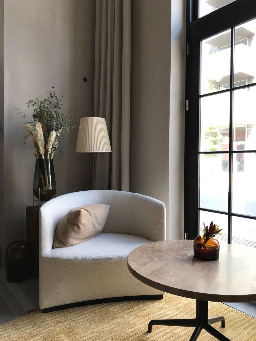
The Audo Hotel In Copenhagen - A New Creative Residence by MENU
It may be five months since my first look at The Audo, Copenhagen's newest hotel to launch, but I already can't wait to return.
Imagine, if you will, a hybrid boutique hotel and restaurant combined with a concept store, co-working space and cafe. A collaborative residence where Nordic design, hospitality and contemporary art converge.
The result is a collaboration between former CEO of MENU, Bjarne Hansen, and Jonas Bjerre-Poulsen of Norm Architects. As you might be able to tell, this is no ordinary hotel experience.
Forty years ago when Hansen founded MENU, he had a vision of a living, ever-evolving space in which the brand's portfolio of furniture would sit within a real-life situation. Today, MENU's brand new HQ shares the first floor with a library and coworking space.
Taking its name from an acronym of the Latin Ab Uno Disce Omnes, meaning 'From one, learn all', The Audo is a reflection of the way in which we use spaces as multi-functional, ever-evolving hubs. This is a place to commune, collaborate and create.
Blurring the lines between home and work, and uniting design, business and community in one innovative, physical space under constant renewal, The Audo is an experiential, sensorial residence where products from the world’s premium design brands will engage in dialogueDanny Feltmann Espersen, MENU CEO
The building is a breathtaking example of how heritage and architecture blend seamlessly with a contemporary aesthetic. Located in Copenhagen's new waterfront district of Nordhavn, it started life in 1918 as a boathouse and Neo-Baroque residence and was originally the headquarters of The Russian Trading Co Ltd.
With creative direction overseen by Kinfolk magazine's Nathan Williams, every part of the experience has been considered in meticulous detail.
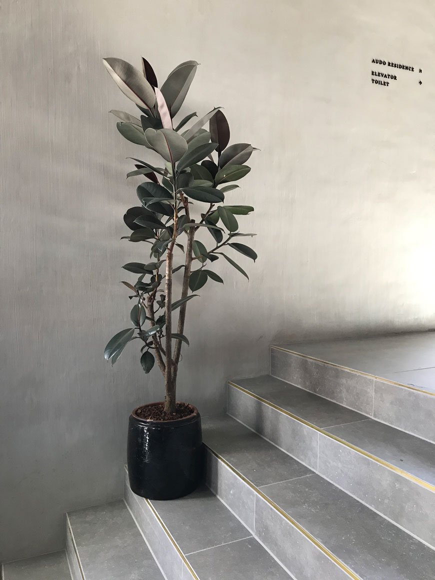
The interiors are a feast for the senses. Converted in a minimalist, Scandinavian style, the industrial roots of the building are ever-present through the use of polished concrete floors, black metal framed windows and perforated black metal ceilings.
Original partitioning walls were knocked through to create one large open plan ground floor, featuring the concept store, cafe and restaurant space.
Sumptuously upholstered Tearoom Club Chairs and Eave modular sofas in bouclé sit alongside black veined, white marble plinths and coffee tables. Abstract works of art and sculpture created by artists such as Benjamin Ewing, Sofia Tufvasson and Nicholas Shurey on display can also be bought from the concept store, alongside products from other collaborating brands.
A wide amphitheatre style staircase leads you up to a library and workspace on the 1st floor where lifts await to residents up to the rooms.
A celebration of rich and earthy neutrals, 10 loft-style bedrooms make up the boutique hotel on the top floor. With names like Foliage, Red Clay and Cliffs, you get a sense of how nature has directed the interiors.
Each room has its own identity with en-suite bathroom, featuring Dinesen floors, textured plaster walls by St Leo and luxury beds designed by Dux. These spaces are warm and intimate, moving away from the industrial feel of the ground floor and closer to the building's history with original timber beams in the ceiling.
Rooms start from £320 a night, complete with goose down duvets from Quilts of Denmark, organic Tekla bathrobes and Aesop toiletries. It's an absolute design lover's joy to experience what feels like a fresh take on Scandinavian living. I can't wait to see how The Audo will reinvent itself in the coming years.
The Audo | Århusgade 130 | 2150 Copenhagen | Denmark
Photography © Tiffany Grant-Riley
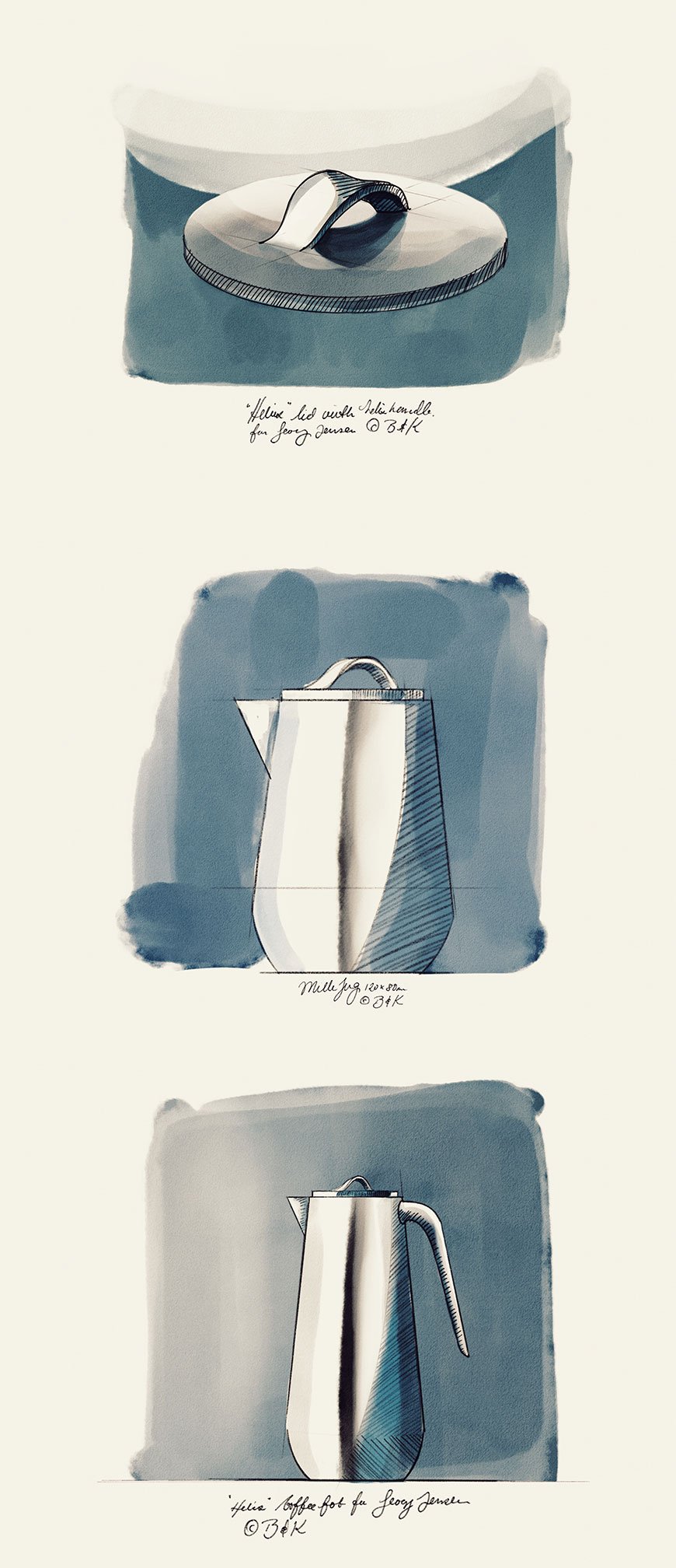
[AD] The Helix Collection - A New Modern Classic From Georg Jensen
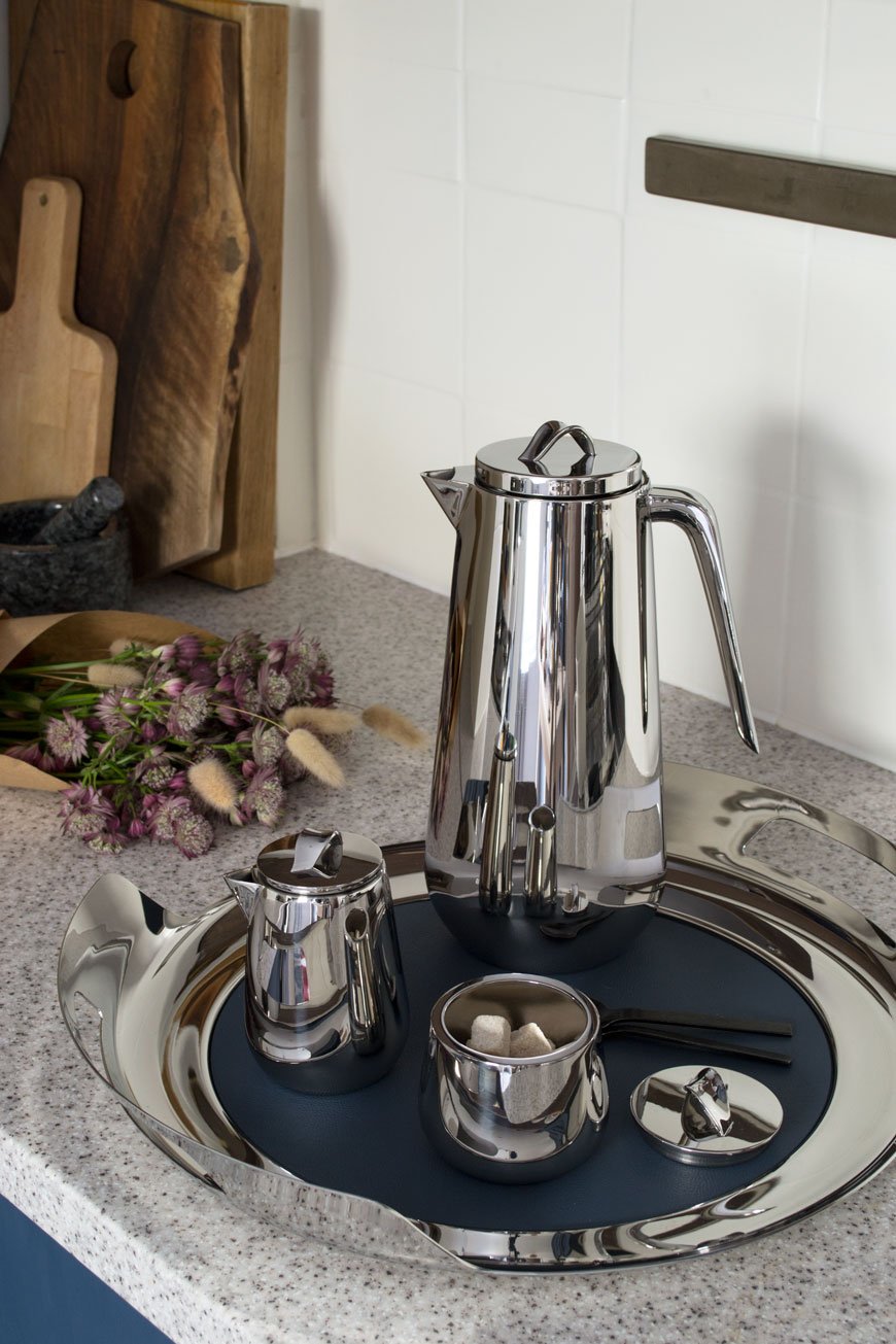
[AD - the Helix collection is a paid partnership with Georg Jensen]
There's a new kid on the block from Danish silverware giants Georg Jensen. The Helix collection, a contemporary design from Stockholm based duo Bernadotte & Kylberg already has all the hallmarks of a modern classic. In fact, it sits so well within the Georg Jensen story that I'm surprised it wasn't created 50 years earlier.
And yet, Bernadotte & Kylberg were adamant not to be overly influenced by what has gone before. Mindful of Georg Jensen's heritage, the duo were keen to bring new perspectives into the design process, ultimately creating a characteristically functional and elegant collection. Defined by simplistic twists set onto the lids, the helix shape (the Greek translation of 'spiral') becomes part of its function.
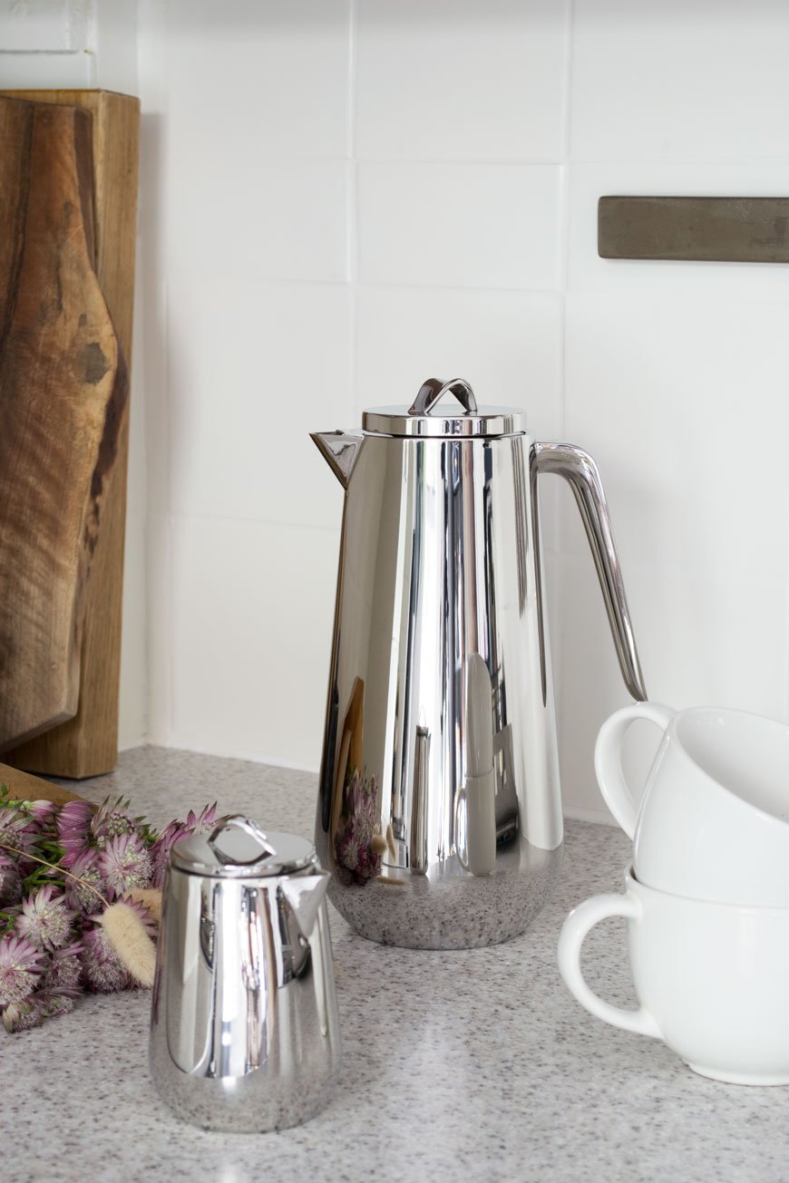
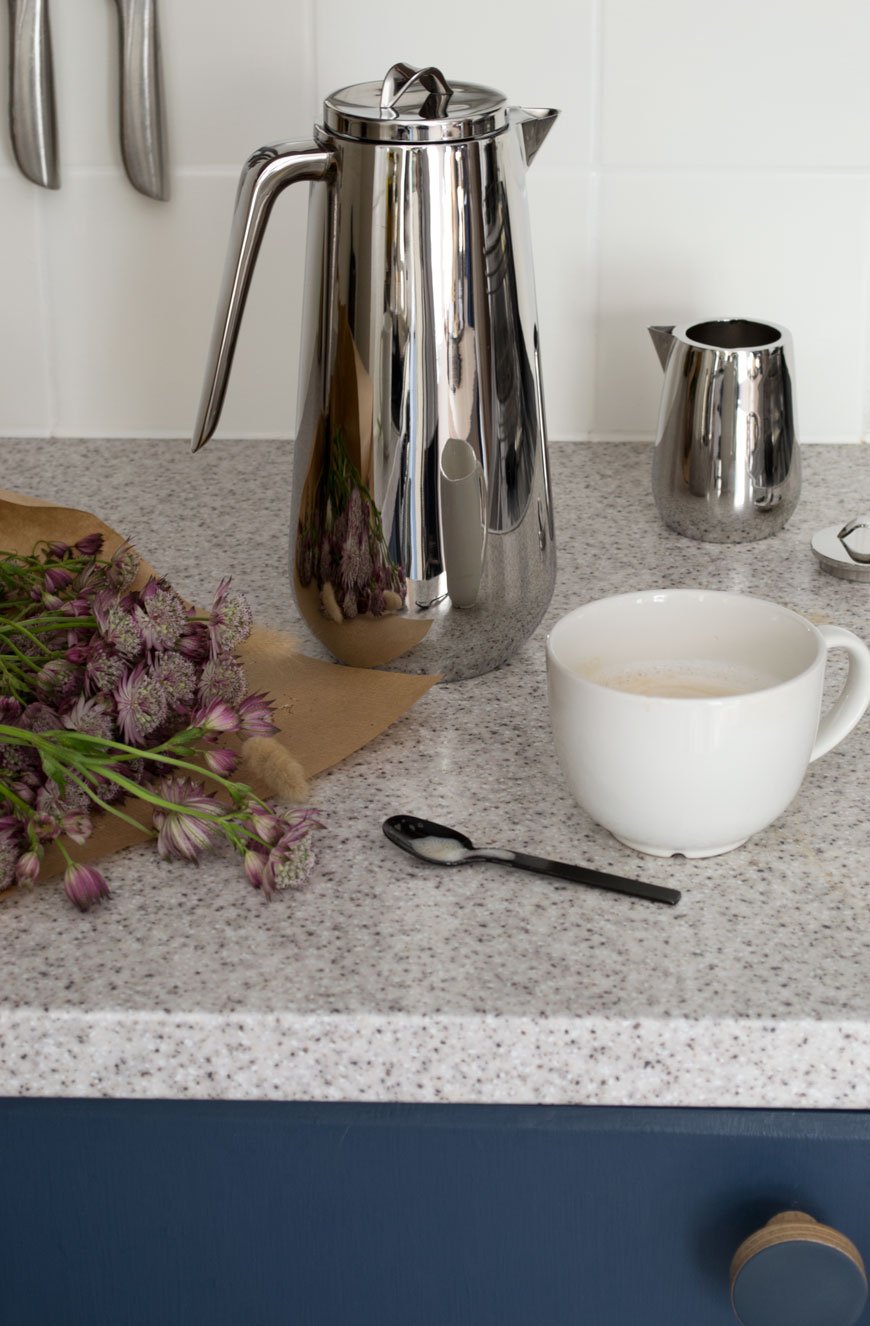
Carrying forward the centuries-old ritual of enjoying tea and coffee, the five-piece stainless steel tea and coffee service set, consists of a Thermos coffee jug, insulated teapot, sugar or bonbonniere pot and milk jug. Tied together with a sculptural serving tray, a deep blue leather mat on the base keeps everything from slipping, protecting the steel beneath.
I've continued the blue thread which runs throughout Georg Jensen's identity into my own kitchen. You can imagine how much I loved that the leather mat matched the blue cabinets so perfectly!
Made from highly polished stainless steel, their sleek shapes reflect a rare glimpse of autumnal sunshine bursting through the window.
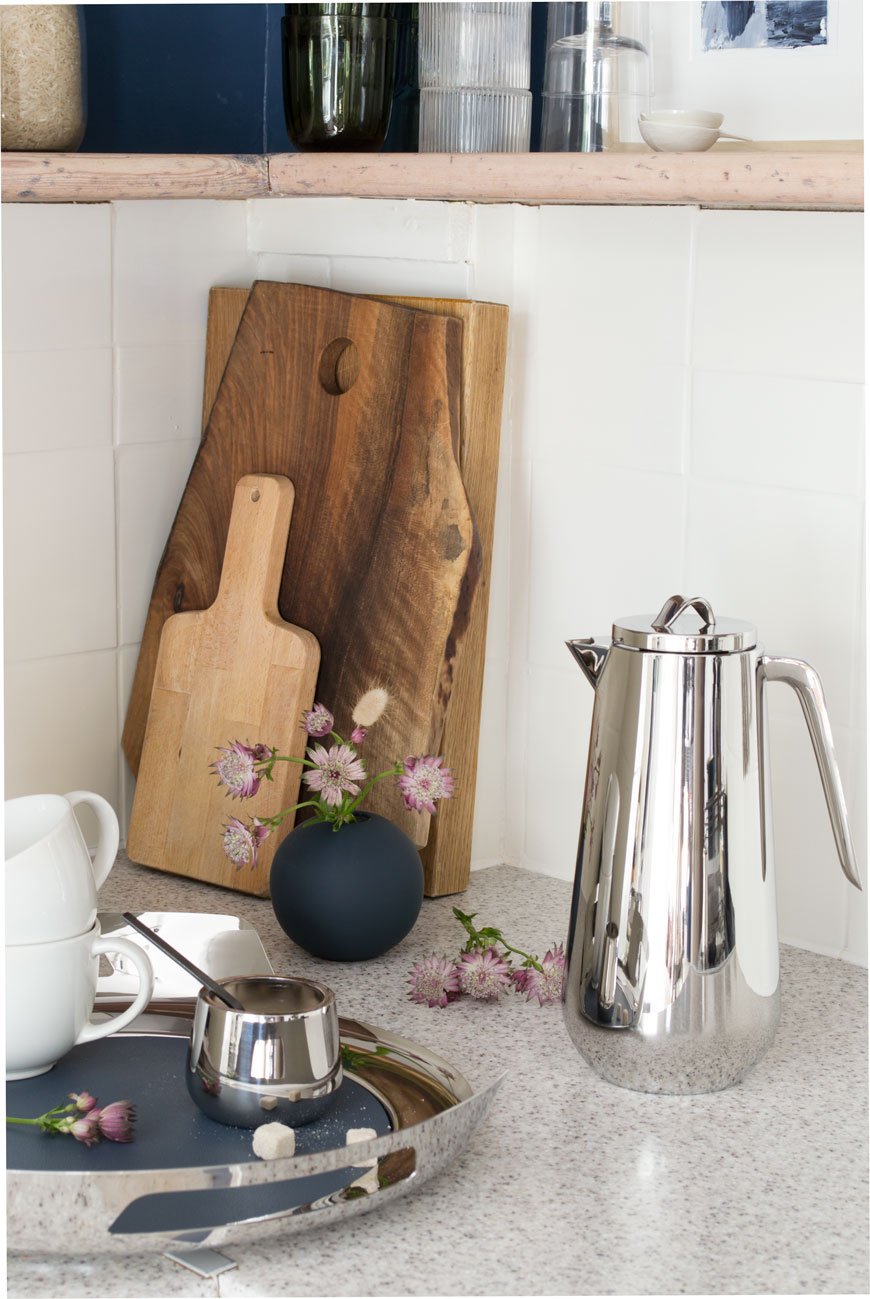
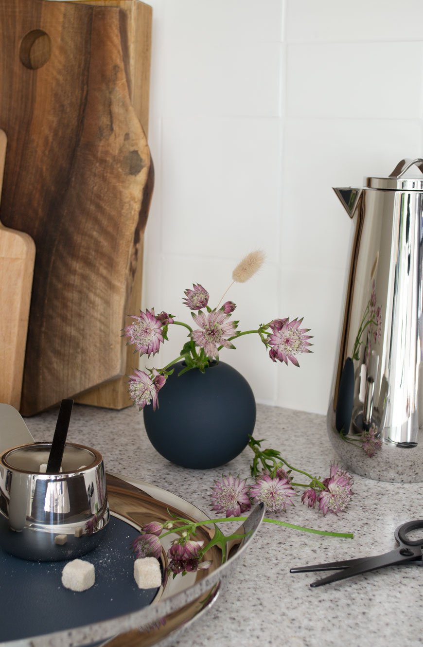
It's a real pleasure to use this set and taking your time is all part of the experience. From the sculptural handle in the Thermo Jug to the twist of the lid on the Milk Jug, you can appreciate the craftsmanship that's gone into each piece.
Although its contemporary, industrial aesthetic is enough to earn its keep, the Helix collection has been designed with function in mind. The coffee thermo keeps fluids hot or cold for up to six hours and the spout never drips after pouring.

Thermo Jug, £170 | Helix Tray, £160 | Milk Jug, £60 |Bonbonniere, £50.
If you love the Helix collection, you might like the simplicity of the Bernadotte collection too, also designed for Georg Jensen.
Photography and styling © Tiffany Grant-Riley.
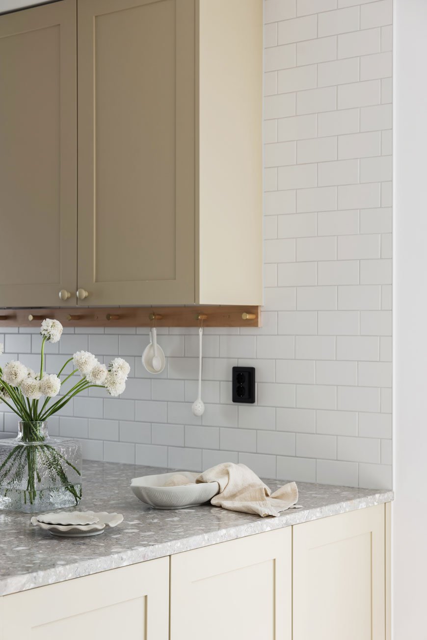
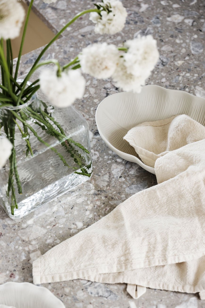
25 Small Kitchen Storage Ideas and How To Maximise Your Space
Dead space. You know what I'm talking about. We all have some weird corner of the house where literally nothing fits. In this scenario, I'm using the kitchen as a case study, getting stuck into some small kitchen storage ideas to help you out of that spatial rut.
Being as they are such a personal space, there is no one size fits all solution. If it's not possible to completely gut your kitchen and start again, particularly if you're renting, then it's likely you're living with someone else's configuration.

I've been there myself with our own kitchen. The cupboards were (and still are) a badly considered home DIY job, so despite the fact we chose to keep them for now, they're completely impractical. Next to the fridge was a gaping 1m wide empty space that I felt could be put to better use. And then there was the conundrum of making the best of the available wall space.
But where to find the right piece of storage to fit that tiny gap? Having spent a good few hours sourcing the right fit for my own kitchen, I'd say I'm fairly qualified to answer that question now...
Keep Worktops Clutter-Free and Edit Your Kitchen Equipment
One of the worst things you can do in any kitchen to make it feel smaller is to have all your equipment out on the worktop. It's a recipe for instant overwhelm. Tidy away the heavy-duty cake mixer or the toaster and bring them out as and when you need. You'll find having that extra worktop space leaves the entire kitchen feeling bigger and you get back the much-needed elbow room to prep with. While we're on the subject of tidying, try to edit your utensils and equipment once a year or so. You might feel that you don't have enough storage space in your existing cupboards, but sometimes it comes down to owning too much stuff. Be ruthless. If there are things you've not used for 6 months then its time to move them out.
Utilise Walls and Ceilings For Storage
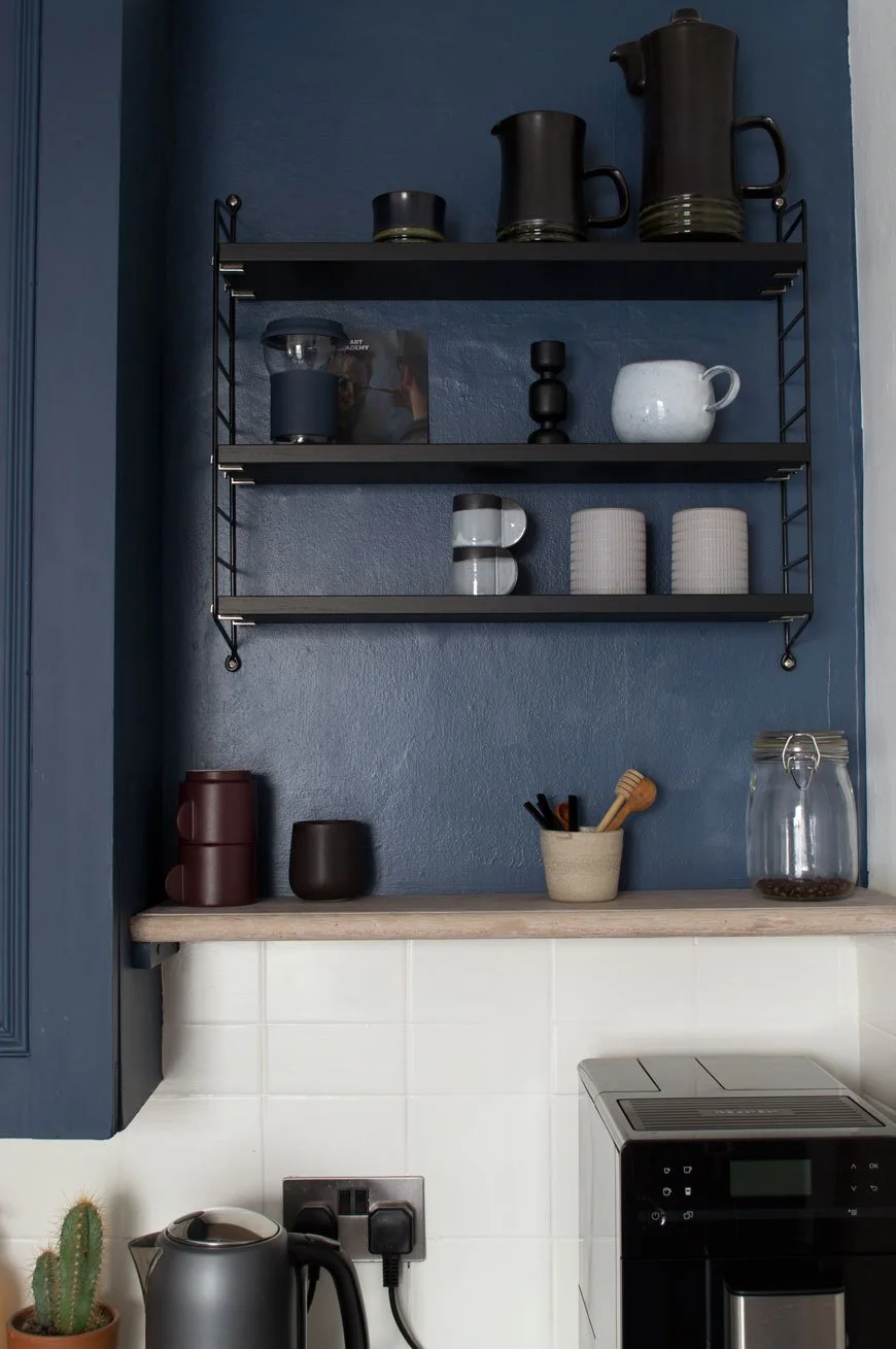
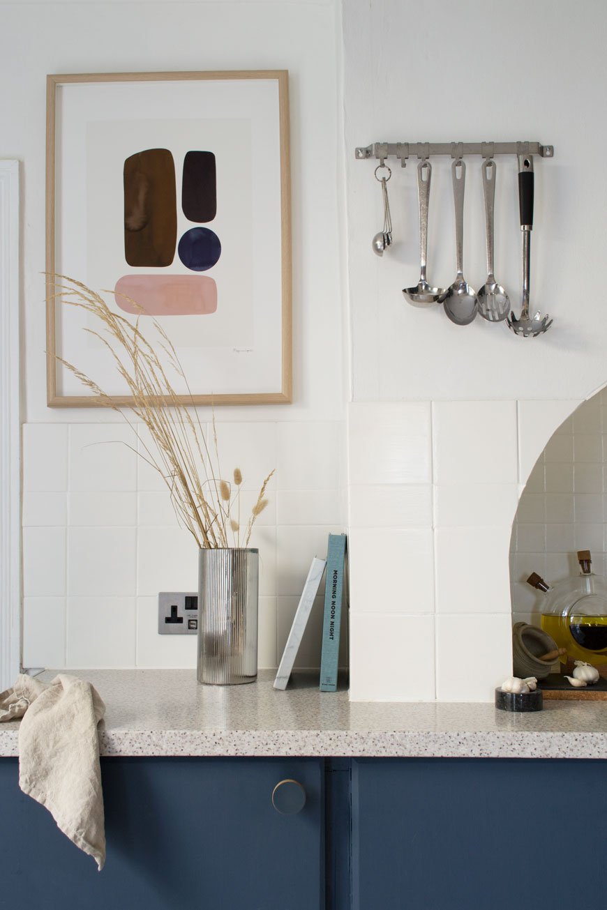
There's a shelf for every nook (as my shopping page below reveals). Make the most of all the available wall space with compact storage. Adjustable shelves will be your best friend. I love my String Pocket shelves for that reason. I can play with the height of the shelves if I need to and I've used them to zone a tea and coffee spot, holding all the necessary accoutrements for a decent cuppa.
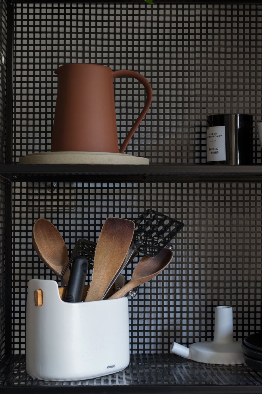
Ceiling mountable pot racks and rails are also brilliant for freeing up space. Cooking utensils hung from a simple rail next to the oven keeps them close at hand (see top image) or you might have a spot above an island or butcher's block that would support a hanging pan rack.
Retrofit Kitchen Cupboards
If you can't replace the units, retrofitting your kitchen cupboards is a straight forward way to maximise space. You can get hold of all sorts of gadgets to fit inside not-so-practical cupboards that slide out and unfold. Tiered wire racks that sit on top of existing shelves are useful for stacking mugs and glasses inside. Store pan lids on racks attached to the inside of a cupboard door to put an end to battling with them in drawers.
Break Up Your Cabinetry and Consider Open Shelves
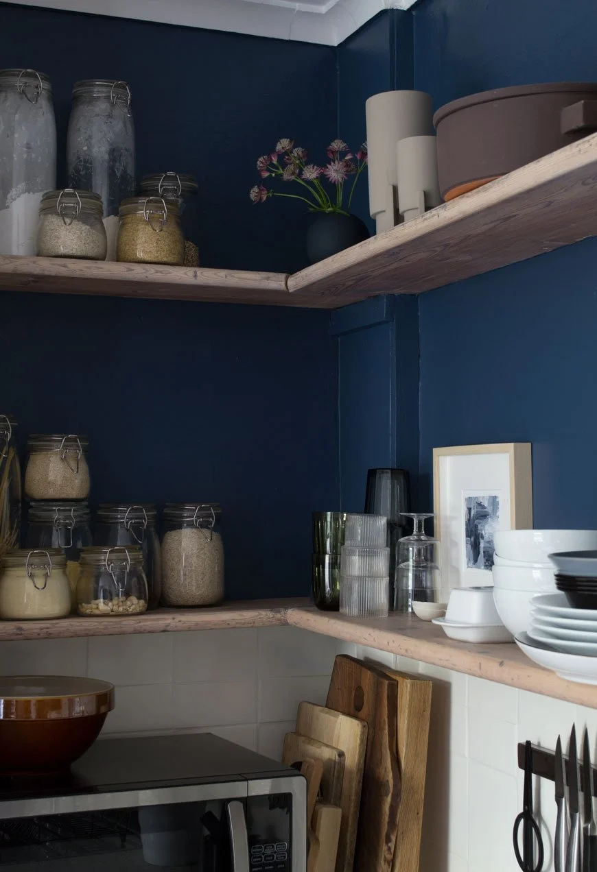
Open wood shelves styled with glass food jars and crockery in a dark blue and white Scandi style kitchen.
Sometimes wall to wall cabinetry can make a kitchen feel overwhelming and enclosing. Introduce open shelves to break them up. Mine were already here when we moved in so I sanded them back and lightened them up with a white Osmo oil. They create an instant feeling of space and give then kitchen a more informal and relaxed look especially when you mix up stacks of glasses and crockery or display dry food in glass storage jars.
Freestanding Units Give Empty Corners Purpose
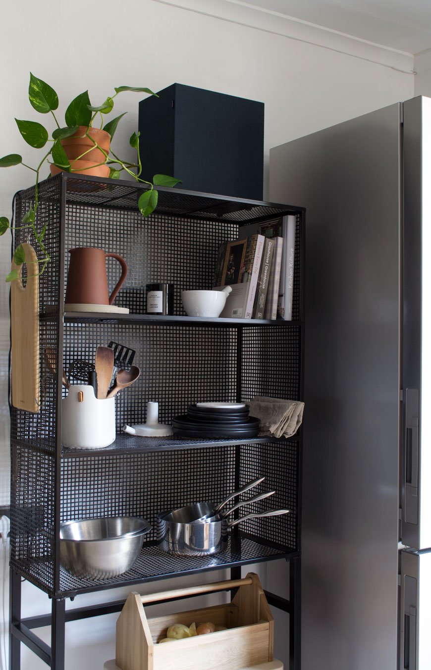
If you have a narrow corner going to waste in your kitchen, a freestanding unit might just be the answer. They add visual interest and look effortlessly stylish. I've written a post that covers how to style wire shelves to help with that.
Possibly my favourite piece of furniture in the kitchen for its flexibility, this wire rack holds all the kitchen essentials we need to hand. Its open, gridded structure helps the kitchen retain a feeling of space and I can use the sides for hanging utensils too. There's also enough space beneath to keep a small carry box of veg and a stool - sometimes friends like to sit and chat to me while I'm cooking.
I've sourced 25 small kitchen storage ideas to whet your culinary whistle, from narrow units and hanging pegs to trolleys and folding tables. I've made a note of the width for each design with most coming in at less than 60cm wide.

1. Hahn premium wall rack, John Lewis. £110. 60cm wide. Make the most of wall space above the oven with a professional-grade chrome pan rack. Stack pots and pans on top, hang utensils from the rail below. (Affiliate link).
2. Iris Hantverk Knoppbräda hook rack in birchwood, Nordic Nest. £15. 67cm wide. I'm a huge fan of this Swedish heritage brand who employ visually impaired craftsmen to produce their products, made from natural and sustainable materials.
3. String Pocket shelves, Skandium. £126. 60cm wide. This miniature version of the classic String shelf is ideal for small nooks. They come in just about any colour and the height of the shelves is adjustable to support how you use them.
4. Storage board grid shelf and additional wire basket, Granit. €49.90 and €9.90. Shelf 60cm wide, basket 20cm wide. Any storage you can configure yourself is an instant winner. This grid shelf is brilliant, with add-ons such a mini shelf, hooks and baskets to store spices or washing up essentials.
5. Verberöd shelving unit, Ikea. £95. 45cm wide. Corners and narrow spaces are always tricky in a small kitchen, which is why I've picked this steel-framed shelving unit. Use the drawers for cutlery and linens and style the open shelves with dried foods in glass jars and stacked tableware.
6. Kriptonite Shelf with borders, SCP. £99. 60cm wide. Sometimes you just need a little shelf above the kettle for your mugs and tea bags. This simple aluminium shelf from Italian company Kriptonite brings a contemporary look to any nook.
7. Frama D27 shelves in brass or steel, Finnish Design Shop. £131. 40cm or 60cm wide. A reinterpretation of Scandinavian shelves from the 1950s, this minimal design with oiled oak shelves come with brass or steel supports. (Affiliate link).
8. Hay Medium Indian Dresser, Made In Design. £155. 40cm wide. Inspired by ones seen in traditional Indian kitchens, this versatile dresser works really hard. Stack plates, cookbooks and crockery on the shelves. Hang tea towels and mugs from the rail underneath.
9. Maze Triple Shelf, Trouva. £131.49. 38cm wide. Maze is an environmentally conscious brand from Sweden where all its products are made by hand and shipped, not flown. Made from powder-coated wire, this nifty little unit has bags of storage potential. (Affiliate link).
10. Ferm Living Wooden Multi Shelf, Utility Design. £405. 59cm wide. The epitome of sleek, minimal Nordic design made from stained ash.
11. Jessie Oak Leaning Shelf, Habitat. £95. 36.5cm wide. You won't take up huge amounts of floor space with this leaning shelf and it can be attached to the wall for extra stability.
12. Verso Design Koppa Shelf, Finnish Design Shop. £86.65. 40cm wide. A sweet and beautifully crafted birchwood shelf for keeping your washing-up bits and bobs off the kitchen top. (Affiliate link).
13. Ombyte storage on castors, IKEA. £50. 38cm wide. Got empty space underneath your worktops? These stackable, moving crates might be the perfect solution.
14. Alta hanging aluminium pot rack, MADE.COM. £25. 91cm wide. Keep pots and pans clear of the worktops with this ceiling-mounted brushed aluminium pot rack with adjustable hooks. (Affiliate link).
15. Small oak shelving unit, Rose & Grey. £175. 81cm wide. This clever little oak shelving unit has compartments on the bottom shelf - perfect for linens and cutlery, and a narrower open top shelf.
16. Izzy Bistro Wall Dining Table, MADE.COM. £199. 56cm wide. Having seen this at the press launch last summer, I'd still very impressed by it. With space for concealed storage when folded against the wall, it becomes a neat little fold down dining table when opened up.
17. Hay Woody Column Shelf, Finnish Design Shop. £322. 75.5cm wide. A modern take on the traditional ladder shelf with a soap-treated oak frame and bent steel removable shelves. (Affiliate link).
18. Hakola Riippu wall shelf, Finnish Design Shop. £240. 60cm wide. These playful oak shelves designed by Finnish company Hakola feature sailing rope struts. A similar design, the Riippu 'Gardening Shelf' holds space for three small plant pots on the bottom rung, perfect for herbs.
19. Round Bamboo Shelf, Rose & Grey. £75. 60cm wide. Undoubtedly the sustainable material of the moment, this sweet bamboo shelf is perfect for displaying a collection of mugs and other ceramics.
20. Long Lina Shelf, Noo-Ma. €170. 80cm wide. A minimal design from the Polish design brand Noo-Ma, the powder-coated steel shelf comes in black, blue and beige.
21. Yamazaki three-tier storage trolley, Amara. £130. 13cm wide. The Japanese know a thing or two about utilising space. A brilliant storage solution for tiny nooks, this narrow storage trolley fits neatly inside the gap between your fridge and cupboards. (Affiliate link).
22. Adjustable brass and wood shelf, Rockett St George. £90. 64cm wide. Bring some warmth into the kitchen with these brass and mango wood shelves. You can adjust them according to what you're displaying and they're ideal for smaller items.
23. Karakter Trio Shelves, Holloways of Ludlow. £372.30. 50cm wide. Take on those sneaky little corners and make them work harder. The result of a collaboration between Achille Castiglioni and Giancarlo Pozzi, these shelves utilise unused space hiding in corners.
24. Antique bronze finish hook rail, Rockett St George. £22. 70cm wide. Perfect for hanging kitchen essentials and small chopping boards.
25. Skagerak Norr Shelf, Amara. £225. 36cm wide. Designed by a company known for its sustainable and ecological practices, the Skagerak Norr shelf effortlessly combines oak, leather and brass into a beautiful, tactile piece.
Photography and Styling © Tiffany Grant-Riley
[AD] Update And Elevate Your Dining Space with Pepper Sq
[Advertisement - this is a paid partnership with Pepper Sq.]
Sourcing the right furniture for your home takes time, especially when you're pulling elements from several different places. Which is why I'm introducing Pepper Sq today. A new homeware brand with a difference, their clever 'Spacemaking' tool takes some of the time and decision making out of the equation. It follows three simple steps:
1. Discover - Browse their impressive collection of room designs, compare styles and find your favourite.
2. Design - Customise your favourite room designs, check dimensions, match colours, choose patterns or find alternatives.
3. Enjoy - Turn that space into a thriving reality. Click and buy - you'll soon enjoy your new room design.
Grouping together a series of looks for each room of the house, furniture can be bought as a whole collection or edited accordingly before you buy. The best part of that is having a visual reference so you can imagine how it might look in your own home.
With this in mind, Pepper Sq invited me to share some advice on how to design a dining room using pieces from their collection.
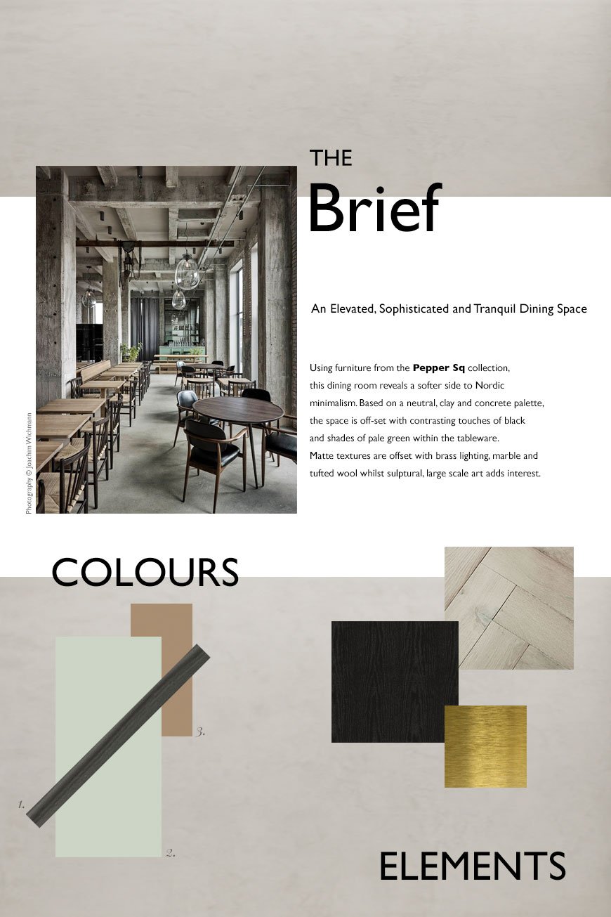
The Brief - An Elevated, Sophisticated and Tranquil Dining Space
My initial thought was, what does a dining space look like today? I use the word 'space' intentionally, as in recent years, the traditional dining room has taken a back seat in favour of open plan kitchen/diners. It seems our kitchens have become the room that we naturally gravitate to as a social space, so the rising trend in kitchen living spaces shows just how much entertaining has become a part of our culture.
There's definitely still something to be said for a separate dining room though. And with some consideration, it can become a room for every day, not just shut away for special occasions...
With the topic of sustainability and the environment high on the agenda, many of us are looking inwards and homewards for comfort as an antidote to all the uncertainty. I wanted to create a welcoming, sophisticated and calming space with Nordic influences. Drawing on 'Tranquil Dawn', the Dulux 2020 colour of the year for its soothing influence as a new neutral, the scheme includes touches of pale green accessories against mid-grey limewashed walls and warm, parquet wood flooring.
There is brass detailing running through the lighting and tableware to warm up the colder tones in the limewashed walls. And I've used black as a welcome contrast to a rather tonal palette with black oak furniture.
Ultimately, I wanted to create an elevated space that makes using it every day feel special.
Inspiration
I pulled inspiration from the work of Copenhagen based studio Space Copenhagen. If you saw my stay at The Stratford hotel, their latest project, you'll know I was bowled over by the Brasserie. Set against a backdrop of soft, sand toned, textural lime painted walls, classic black bentwood chairs and brass detailing, it was the epitome of Nordic sophistication.
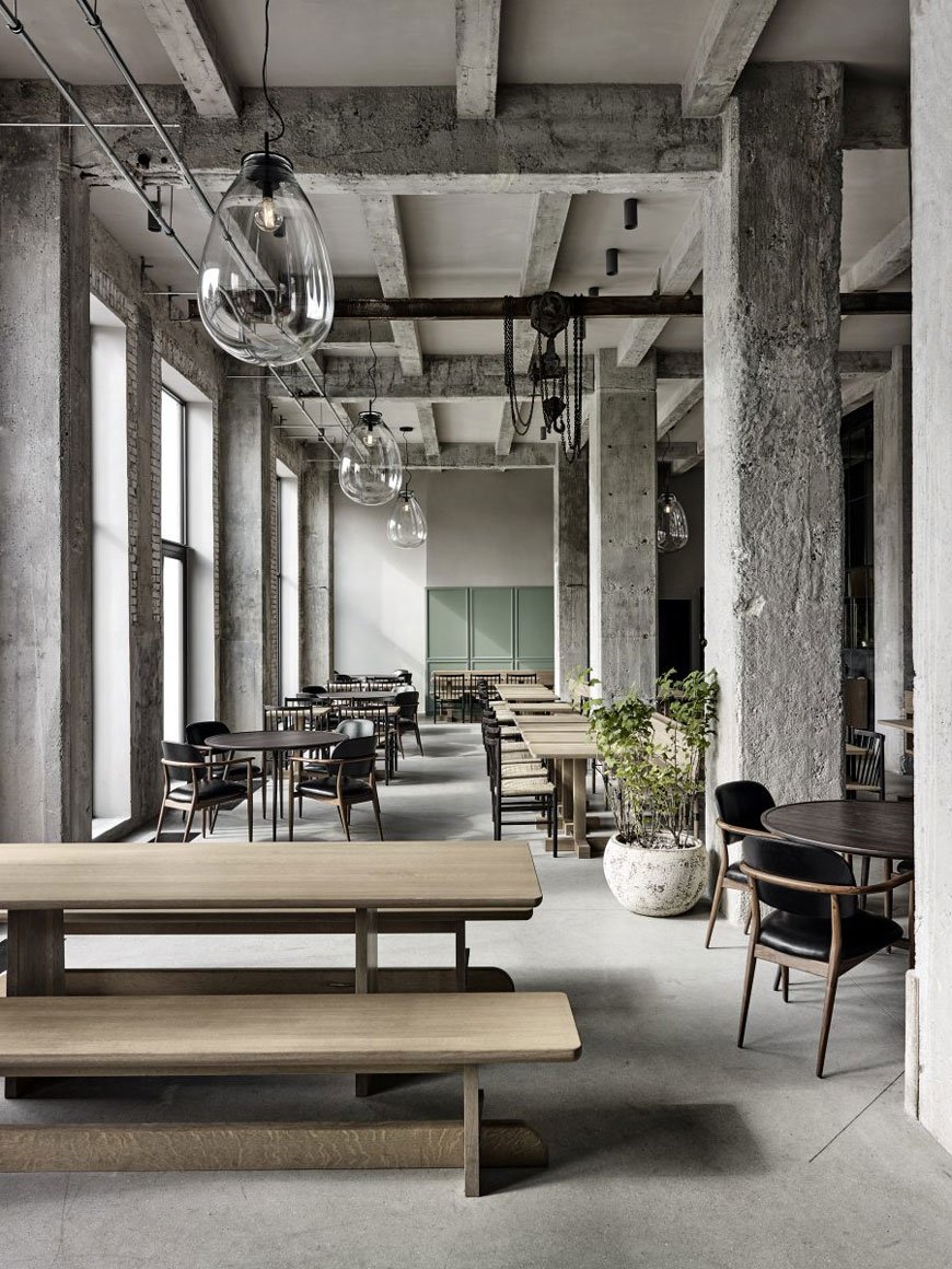
Diving deeper into their portfolio, I came across Restaurant 108 in Copenhagen, the sister to the legendary NOMA. The interior has retained its industrial concrete shell but introduces a softer side with seafoam green panelling on the bar and other parts of the restaurant. Although the exposed structure of the building appears very much essentialist in the way it has been designed, it is warmed by bespoke oak dining tables, curved back black leather chairs and potted plants.

The Finished Look
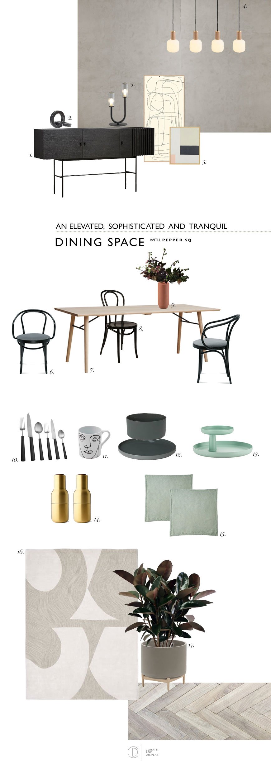
|1| Array sideboard, Pepper Sq |2|Marble Circles, Kristina Dam |3| Flora black table lamp, Pepper Sq |4| Oblo bulbs with oak and brass knuckle pendants|5| Abstract BYC Design & Tom Pigeon prints, Opumo |6|Berlin armchair, Pepper Sq |7| Alley oak dining table, Pepper Sq |8|Antwerp bentwood dining chair, Pepper Sq |9|Skagerak Edge vase, Finnish Design Shop |10| Ebony cutlery, The Conran Shop | 11 |Linea face mug, The Conran Shop |12|Agave green ceramics, Blomus |13| Rotary Tray, Vitra |14| Menu brass Bottle Grinders, Really Well Made |15| Mint linen napkins, The Conran Shop |16| Bold cut-out rug, West Elm |17|Florian concrete planter, La Redoute.
How To Choose The Right Dining Table
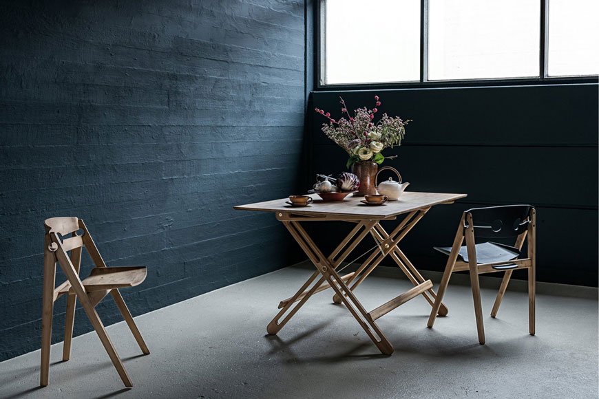
The dining table you choose will depend on the proportions of the space you have. If you have a fairly traditional, narrow room (like mine) then a rectangular table will be your best bet. I've picked the Alley table in light oak and brought in those touches of black I mentioned in the metal supports underneath. When you have a little more freedom of space or a squarer room then a round design would work well, providing you have enough space to walk around it with chairs in situ. It's also worth considering how many you need to seat at mealtimes. If you entertain a fair bit, an extending table affords you extra space at short notice.
I love the timelessness of a bentwood chair, with a history that spans from the 19th Century, they're an enduring classic. I've mixed the Berlin armchair at either end of the table with a black Antwerp for a less matchy but still coherent look. Don't feel obliged to match all your chairs but choose a colour or material that ties them together.
Light Up The Table and The Room
Creating the right atmosphere with lighting is really important - you want the room to invite conversation. For above your table, find lighting that echos its shape. For example, a rectangular or linea grouping of pendants better suits a long table. Look at the direction the lights are facing in too and how it will affect the way the light falls onto the table or ceiling. Shades made from an opaque or smoked glass or wood veneer will give an altogether softer and warmer feel, which I love. Oblo LED bulbs paired with oak and brass knuckle pendants allow you to build your own statement lighting with diffused opaline glass.
Don't forget the rest of the room too. Table and floor lamps are just as important for providing ambient light, particularly if you don't like to use an overhead light in the dining room. The Flora table lamp has a sculptural style that just needs to be displayed alongside some art.
To Rug or Not To Rug?
Here's where I sit on the fence. I love to see a rug in a dining room when it's the right size. It helps to anchor and zone the space, particularly if you have an open kitchen/diner. A round dining table looks better with a round rug, likewise if you have a rectangular one. For a balanced look, ideally, the rug should be approx 24" to 28" wider than your dining table all the way around.
On the other hand? Having a young family means not having nice things. Ever. Believe me, I know how quickly that beautiful, hand-tufted 100% wool rug will end up caked in spaghetti and tomato sauce. If you have to have something, go for a flatweave that's easier to clean, or veto it entirely. If you don't want to forego the rug, try using one in conjunction with a sideboard instead so that it sits halfway underneath.
Why you need storage in your dining room
Sideboards and cupboards work really hard in a dining room, streamlining your view from clutter. Use one to free up extra space in the kitchen by storing the items you don't use every day along with other essentials like cutlery, cookbooks and table linens. I wouldn't be without ours, as it stores all the above as well as the kids' art supplies.
The minimal, clean lines of the black oak Array sideboard tie in beautifully with my moodboard, combining function with a striking, geometric form.
So there we have it, a few solid tips to help you update and elevate your dining room, with the help of the #peppersq #spacemaking tool for inspiration. I really can't wait to start renovating ours now...
![[AD] Stay At The Stratford Hotel London](https://images.squarespace-cdn.com/content/v1/63c93d56b8f27c4ca17f2ed3/1682502077231-U57MFQH2DCLB7W0KG23G/The_Stratford_Hotel_11.jpg)
[AD] Stay At The Stratford Hotel London

[Advertisement - my stay at The Stratford Hotel was complimentary in exchange for this review]
To coincide with the London Design Festival, each September for the last three years I've made it a tradition to test out new London hotels with my friend and fellow blogger Hege Morris. She'll fly down from Glasgow, we'll spend a couple of days soaking up the festival and review a place to stay whilst we catch up. And I've been waiting what feels like an absolute age to share this absolute stunner of a London design hotel with you...
Meet The Stratford. Having watched this 42 storey, terracotta clad structure rise from nothing just outside Stratford International Station, I have been itching to get inside it.
Following the 2012 London Olympics, Stratford has grown up at an astonishing rate, with 560 acres of waterways around the buzzing East Village, Queen Elizabeth Olympic Park and its best kept secret - the Great British Garden. A stone's throw from the hotel stands Westfield Shopping Centre, a sprawling metropolis in its own right and the area as a whole feels very open and full of possibility. At the time of writing, construction is underway for a new arm of the V&A Museum, Sadler's Wells and Madison Square Gardens. Stratford's where it's at, people.

Launched in May 2019, the interiors of The Stratford were left in the capable hands of Danish design duo Space Copenhagen. A multi-disciplinary studio, their work spans furniture, residential and commercial spaces. Having designed collections for some of Denmark's design royalty including Fredericia Furniture, GUBI, Mater and Georg Jensen, you learn to recognise their signature style a mile off. In fact, if you've a keen eye, you'll spot several of their collaborations with these brands throughout the hotel. Known for their use of minimal, organic shapes, honest materials and their unmistakably Nordic approach to creating spaces, this is the place to go for a modern Scandinavian experience.
The Stratford is a completely new build challenging the concept of the traditional hotel. With a combination of hotel and Loft apartments, a restaurant and communal sky gardens, the building encourages guests and residents to interact within its public spaces.

The first seven floors are dedicated to the hotel, announcing a triple height lobby on the ground floor. The interiors are a blend of soft textured walls, inlaid brushed brass detailing and warm wood. Polished marble repeats itself through table tops up to the bar and your eye is drawn towards a curved balcony belonging to the Mezzanine bar above. A large scale art installation, 'Murmuration', created by Paul Cocksedge connects the two spaces together.
A cosy Lounge Bar sits to your left, furnished with marble-topped Gubi Moon lounge tables and sink-into chairs. The space is ideal to kick back over coffee for an afternoon meeting, or perhaps a starting point for cocktails in the evening. A large fireplace looks set to draw everyone in during the colder months.

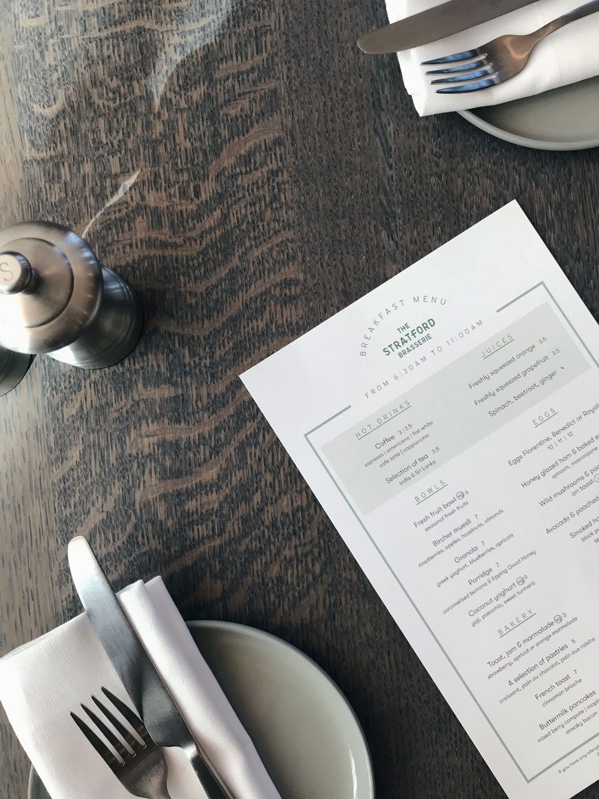
To your right is the all-day Brasserie with open kitchen and view across the entire lobby. It is an utterly gorgeous space. The bespoke wood and leather benches lining the edges of the room present a more mature side of New Nordic design. Pared with classic bentwood Thonet chairs, it’s a sophisticated interpretation of European brasserie style. Light is diffused through full height windows by raw linen curtains, picking up the texture in the walls. And there’s touches of craft here that elevate your experience, like the beautiful matte ceramic mugs and plates, designed by British ceramist Sue Pryke. Of course, what's really important here is the food, which comes in generous portions. I can highly recommend the coffee and Eggs Royale, of which the hollandaise sauce was perfection.

The bedrooms are the epitome of modern minimalist style, each bearing the unmistakeable marks of Space Copenhagen's aesthetic. From the soft, organic curves in the bed frame and mirrors, to the contrast of light and dark materials. When the sun faced West towards the early evening, striking shadows hitting the pale mushroom walls and crisp, white bedding.
Our Standard Room (starting from £175 a night) was based on a tonal grey scheme and felt restful and cocooning with a thick pile carpet under foot. There's a small wall to wall console with a Gubi Gravity table lamp. The Queen or King size beds are nicely styled with blankets from Society Limonata and the bathroom comes with organic REN toiletries. Hanging storage, drawers and a small Dualit coffee machine are hidden by floor to ceiling push door wardrobes as you enter the room.
Additional rooms range from a Double Double (with two Queens for sharing with friends and family) all the way up to a Stratford Studio and the mother of them all - the Manhattan Studio (starting at £515 a night based on two adults).


We were lucky to have tour of the The Stratford Lofts which make up the 35 floors above the hotel. Comprised of 1, 2 and 3 bedroom apartments, the interiors were designed by Paris based Studio KO.

Each loft has a different feel, some with a more polished, warm interior and others like the one pictured which feature the steel structure of the building itself. I loved this pared back, industrial kitchen living space where the concrete structure is left exposed to show the workings in the architecture. Of course, the real scene stealer is the completely unobstructed view across London from each room, thanks to the floor to ceiling windows. A view that would be impossible to ever tire of.

Because the building was designed to encourage community, there are no private balconies. Spread across three floors, The Sky Gardens are accessible to the residents of the lofts. Each garden has a different layout, each with warm wood cladding and raised planters. Designed for relaxation, they include semi-sheltered areas for cooking and relaxing with Japanese inspired planting.
The Stratford Lofts are available to rent for short and long terms stays with the smaller residencies starting from £2,300 pcm.

The new Allegra restaurant was gearing up for its official launch during our visit and I can't wait to come back and sample the menu. Featuring a central bar, a semi-private dining space and outdoor tables overlooking the Olympic park, it oozes elegance. Promising a blend of high-end dining with a focusing on honest, seasonal ingredients, the restaurant is headed up by Head Chef Patrick Powell, formerly of The Chiltern Firehouse.

As a new landmark, it's still early days for The Stratford. It will need some time to grow into itself and discover its identity, but I love the ethos of community it carries forward. Different areas to meet, to experience, to gather. Space to breathe.
Photography © Tiffany Grant-Riley.
[AD] Architectural KG1 Bookshelf | Circular Design From ENKL
[Advertisement - this post includes gifted product from Enkl, Woud, Cooee Design and Massa Design Studio*, chosen by me and lovingly used in my home.]
During my visit to 3 Days of Design in Copenhagen earlier this year, I was lucky enough to meet ENKL, a new sustainable furniture brand whose DNA is built on a circular design model. Their collection of raw and functional pieces combine traditional craftsmanship with a minimal aesthetic.
Who Is ENKL and What Is Circular Design?
Based in Aarhus, ENKL was founded by Kristian Gatten and Lasse Tamberg in 2016. With backgrounds in architecture and carpentry, the friends began designing a capsule collection that would by-pass the traditional "take-make-dispose" production model, exploring ways in which materials could be utilised over and over again. You can see the architectural influences in the structure of ENKL's designs. What I love most is that all the joints, nuts and bolts are clearly visible. Honest and open design with nothing to hide. Each piece of furniture has been designed for easy disassembly so that if and when a piece reaches the end of its life, all the components can be separated, reused and recycled.
To help reduce waste and pollution, production is kept as local as possible with steel and brass elements made in Galten and Lystrup. Oak is sourced from the Czech Republic by a family-run carpentry business and finished at their studio in Denmark.
Enkl also offer to buy back their designs at 10% of the sales price in order to return their materials back into the production cycle. Over time they plan to add to their collection with designs made from the newly recycled materials. How's that for dedication?
The KG1 Bookshelf
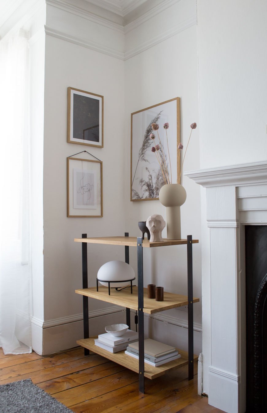
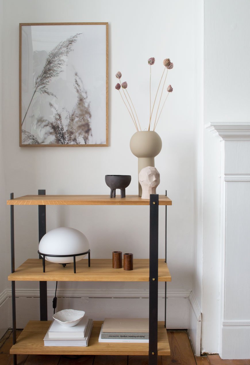
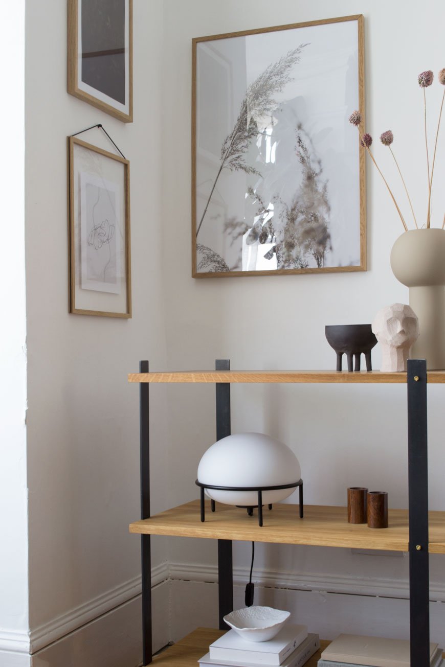
In my eyes, the real stand-out piece from the collection is the KG1 bookshelf. So much so that it now has pride of place in our living room. Although I have absolutely zero intention of recycling it, ever, its environmentally conscious, circular design was a huge plus. I want to continue to make conscious choices as to what I bring into my home and its impact on the environment, so choosing brands who share those values is important. Constructed from three solid oiled oak shelves, its held in a delicate balance with four flat steel legs. I love how its industrial appearance compliments the Edwardian features in this room.

The beauty is in the details - from the brass screws to the highly unusual beeswax finish on the steel which both intensifies the black of the metal and prevents corrosion over time. It smells wonderful up close, a mix of beeswax and linseed oil.
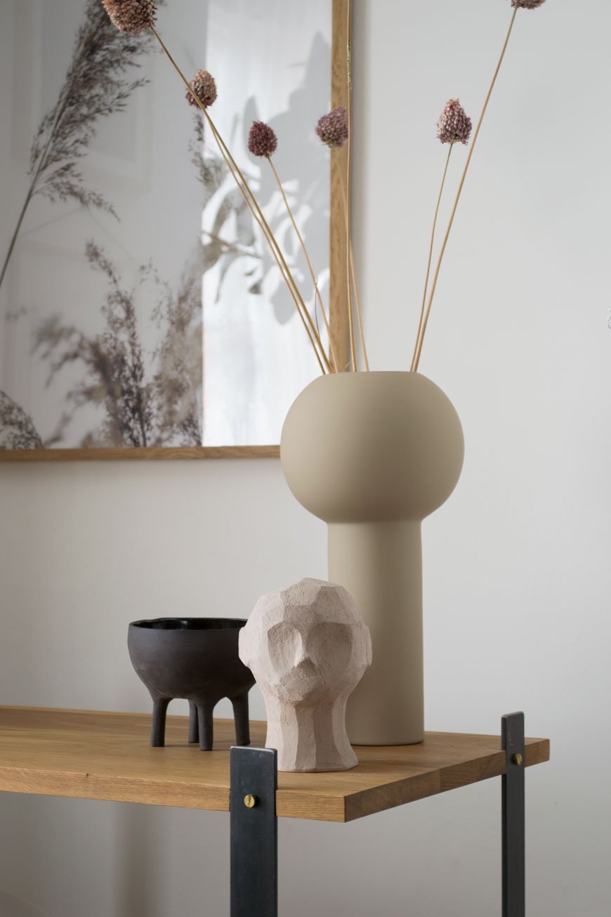
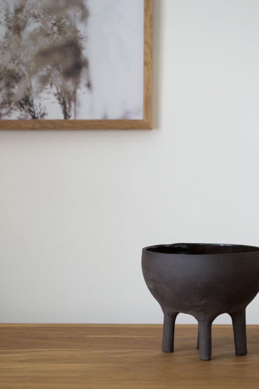
Styled with a few select treasures, the muted, sandy tones add warmth to this corner, elevated with a touch of black. Among them is the Olufemi sculpture from the new collaboration between artist Kristiina Haataja and Cooee Design. Haataja calls her unique approach to sculpting 'Ancient Cubism', combining ancient Greek sculpture with Post Modern Cubist form. I find it soothing to look at, the way the shadows form in the furrows of the concrete.
The little black Elephant pot was an Etsy find, all the way from Israel and made by Massa Design Studio. I love the contrast between the raw stoneware on the outside and glazed interior. See how its shape echoes the Pump lamp? Designed by Kutarq Studio for Woud, the soft light through its opal glass shade gives the impression of lifting off and levitating on its thin metal frame.

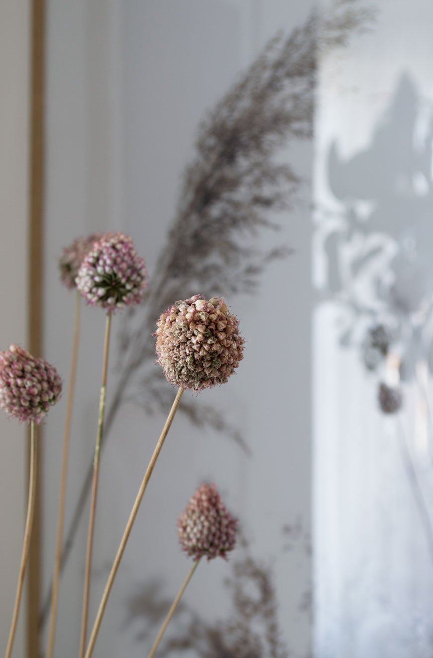
I’ve since dried the deep pink alliums that were growing happily in pots at the front of our house and they've taken on a much softer blush now. Their little bulbous heads are a sweet memory leftover from summer, bobbing around in their vase.
I'll be sharing tips on drying and styling flowers next month - I've grown loads! In the meantime, I'm off to the London Design Festival this week to see if I can't discover another design gem. Watch this space...
*Gifted items - KG1 Bookshelf, Enkl | Pump table lamp, Woud | Olufemi sculpture and Pillar vase in 'Sand', Cooee Design | Elephant pot, Massa Design Studio.
Styling and photography © Tiffany Grant-Riley.
Calm and Grounded Home Launches for Autumn-Winter 19
If the slight turn in temperature hasn't got you reaching for everything cosy, these new Autumn-Winter '19 home launches will. This is my time of year, let me tell you. I live for the blankets and chunky knit jumpers, the hunkering down as the leaves start to fall and evenings draw in.
The latest Autumn-Winter home collections from the high street and beyond seem to offer up a response to all the uncertainty in the news of late, too. That home is a comforting and grounding space in which to be, a reflection of ourselves. Simplicity is a common thread that runs through each collection, tied together in the use of natural, sustainable materials with an artisanal feel and a neutral colour palette.
Yes, I know what you're saying - "but this isn't real, Tiff! Where's the cat vom? The bits of lego on the floor and the two-inch thick layer of dust over everything?" Of course, it's not real, but we all need to aspire to something, right? There are some great styling takeaways to glean from my picks for the coming season. Shall we?
Zara Home - A Life of Simplicity
I've really fallen for the restrained elegance of these almost sparsely decorated rooms. The use of negative space. Sometimes a room just feels better with space left empty. Shot at architect Danielle Siggerud's MD Townhouse in Copenhagen, Zara Home's 'A Life of Simplicity' looks like it belongs among the patinaed walls and aged wooden beams. Mixing pieces from other designers within the styling, a combination of contrasting materials and fabrics lend it a curated, lived-in feel. Highlights of the collection include the Silla chair with cane seat (as seen in the top image), an array of highly textured soft furnishings and organic shaped recycled glassware.
Styling by Colin King, photography Frederik Vercruysse.
Tine K Home - Slow Collection
Set against textured lime painted walls and dark wood floors, the 'Slow collection' by Tine K feels calm and sophisticated. Drawing from nature, a palette of Ocean, Walnut and Terra holds this edit together creating an altogether earthy and cocooning aesthetic.
A brand that continues to produce their collections by hand with small, artisanal workshops, you can pick up on their influences of travel within their Scandinavian roots. Pieces like the woven rattan pendant lamp lend texture to a room and the standout of the collection, the Feelchair, made from recycled aluminium is the latest example of their commitment to sustainability.
Introduce autumnal hues into your home through the plumpcious PufSoft velvet pouf and rough linen lampshades - I love the Ecru.
Styling by Pernille Vest.
French Connection - Le Brun and Dark Shadow
This season French Connection has brought two collections to the table. Le Brun (the brown) which encapsulates an earthy, artisanal craft aesthetic and Dark Shadow, based on minimal lines and concrete brutalism. Yep. My favourite.
An additional capsule collection includes a sustainable range of textiles. Rugs made from recycled bottles and cushions made from denim scraps demonstrate French Connection's 'reuse, recycle, reinvent' approach to production.
Looping back to wanting our homes to feel comforting and grounded, Le Brun draws inspiration from tribal culture and global style in its woven, tasselled accessories and cane furniture. The Parallel chair in acacia wood (as seen above) is designed to fold away and can be used both inside and out.
Styling by Nuala Sharkey, photography Russell Duncan.
Ferm Living
Those soothing, neutral interiors continue on into Ferm Living's A/W 19 lookbook. Never afraid to do Nordic design differently, feminity leads as the main influence with fluid, curved and chunky silhouettes. Irregular shapes found in nature have been applied to some of the pieces making them irresistibly tactile (see the Hebe lamp, above).
Stepping away from tone on tone, the Ferm Living collection is all about contrast. Deep and spicey tones add depth to a muted interior reaching into blue. The ridiculously cuddly Rico lounge chair, first seen here in off-white boucle, has been given a rich update in Tiger Mountain upholstery.
Still top of my list, the Haze Vitrine has been given a softer, more feminine Cashmere colourway and the aptly named 'Braided Belly' pendant lamps in rattan are quietly confident statement pieces.
Photography by Heidi Lerkenfeldt and Martin Neve.
Blooc Build Sustainable Living Housing Projects in Sweden
Taking these gorgeously styled images at face value, it'd be easy to get carried away with the aesthetics. I know I was when I discovered Blooc, a housing project company based in Sweden. It was the light-filled interiors carefully styled with Nordic design and custom details that caught my eye. Oh to have those steel warehouse style windows!
What sets them apart from other new builds though, is that these homes are designed for sustainable living from the ground up.
Launched in 2011, these architect-designed homes offer the best of contemporary city style, creating idyllic new garden communities out in the Swedish suburbs. The new Parkhausen development of semi-detached four bedroom homes is just 10 minutes from Väsby, featuring a muddy green wood-clad exterior. The airy, open-plan style interior is divided by floor to ceiling steel framed glass partitions, a clever way to continue the flow through individual spaces. A classic Scandinavian neutral colour palette runs throughout, from the soft grey linen sofa, textured Berber rugs, light oak furniture and wood floors. But I fell really hard for the garden room with its lush tropical plants, bringing biophilic design into the home and connecting you to nature.
Modern Sustainable Living
According to recent reports in Sweden, only 4% of buyers have the desire or time to renovate, hardly surprising given the time, upheaval and costs that go into one. Anyone who has taken on a renovation project, however rewarding the outcome, will have wished at some point that they'd bought a new property instead. It has definitely crossed my mind a few times as we've uncovered leaks in the bathroom and faced the joyful task of replastering 100 year old walls!
All Blooc's homes are built using sustainable timber and other materials carrying the Swan label, the official sustainability ecolabel for Nordic products. Surrounded by nature, each build is well insulated and fitted out with new energy-efficient appliances to reduce its impact on the environment over time.
Blooc Objects
I was impressed to see that Blooc has its own collection of finishes and details exclusive to their homes. 'Blooc Objects' includes custom mirrors, kitchen cabinetry, bathrooms, handles and lighting used solely in their projects. They also produce a palette of contemporary colours that run through each project and gives it its own sense of identity - see how that muddy green from the exterior is carried into the bathroom cabinetry.
I would love to see more well-considered projects like these popping up in the UK, taking not only contemporary living into consideration, but fully sustainable practices too. What do you think - could you see yourself living here?
Photography courtesy of Blooc.
[AD] How To Make The Garden An Extension Of Your Home
*This post includes gifted product in collaboration with Skagerak Denmark.
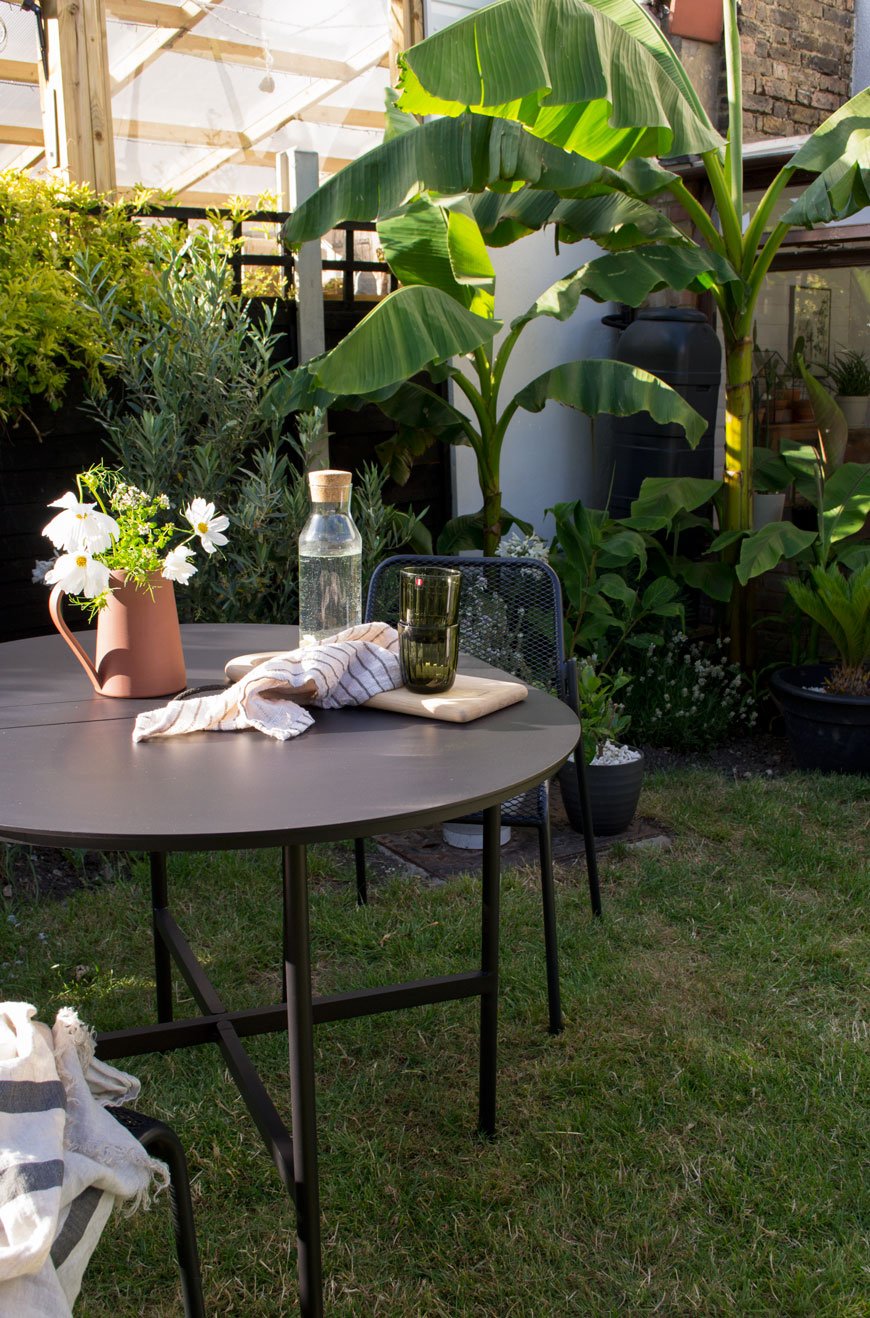
I absolutely love this time of year, when the boundaries between our home and the garden become blurred. Even as we move away from summer now and can feel the seasons beginning to change again, the back door is always open and the garden feels more like a cosy outdoor living space.
As a sort of final salute to the balmy summer months, I'm sharing what I've learned so far about making the garden feel like an extension of your home. It's simple, easy things that can be applied to any space no matter the size or orientation.

Connect The Boundaries
Start with the garden in the same way you would the inside of your home and look at the bare bones. Before you think about plants, consider refreshing the surrounding boundaries, be it wood or metal fencing, brick or concrete walls. Replace any tatty areas if you can. Decide if you want to make an architectural feature of that wall or if you want to tone down the appearance of your fencing.
I'm a huge advocate of the transformative qualities of paint and I personally think black, an anthracite grey or a soft white work wonders as a way to zone and define your garden. You'll see I've carried the black through from the sunroom windows into the garden this way (I used Ronseal Duck's Back in Black). Although at first it might look dominating, black is actually brilliant for making boring fencing look less imposing. Once you add in planting, they'll slowly blend in.
Repeat Similar Colours Through Plants and Accessories
A clever way to strengthen the connection between house and garden is to continue your colour palette from indoors. Pick out similar shades and tones that you've used for your interiors and echo them in your plants, pots and accessories. This way, the boundaries between the two spaces are blurred and as a result, feel better connected when you look out of the window.
Our own home is fairly muted as colour goes but black features regularly as a contrast. I choose white flowering plants and touches of sepia and beige in a variety of ornamental grasses. I mix terracotta and grey pots to break up some of the black. These really stand out against the fencing which in turn create contrast and visual interest.
Scale and Texture
When an interior feels too flat it's probably because it's lacking the texture to give it depth. Remember that spending time in the garden is an experience for the sense - make your plants tactile, introduce scent and don't forget plants that will pick up the breeze for soothing sounds.
Choose a strong mix of large and small scale planting. Don't be afraid to try large-leaved plants such as fig, Musa Basjoo bananas and the prehistoric Gunnera against frondy, smaller foliage like grasses and bamboo.
If you're sticking to a minimal gardening scheme, be bold and go for one or two giant pots - I love the patina of corten steel pots, for example.
Play with different tones in foliage if colour isn't your thing, planting darkest greens against silvery whites.
Create Space For Relaxation
Our habits naturally change in summer when we finally have the freedom to spend more time out in the garden. We might decide to have our coffee outside in the early morning sun instead of on the sofa. An off-the-cuff dinner can be cooked alfresco and enjoyed well into the evening. Make your garden feel more inviting with outdoor furniture that compliments your tastes indoors.
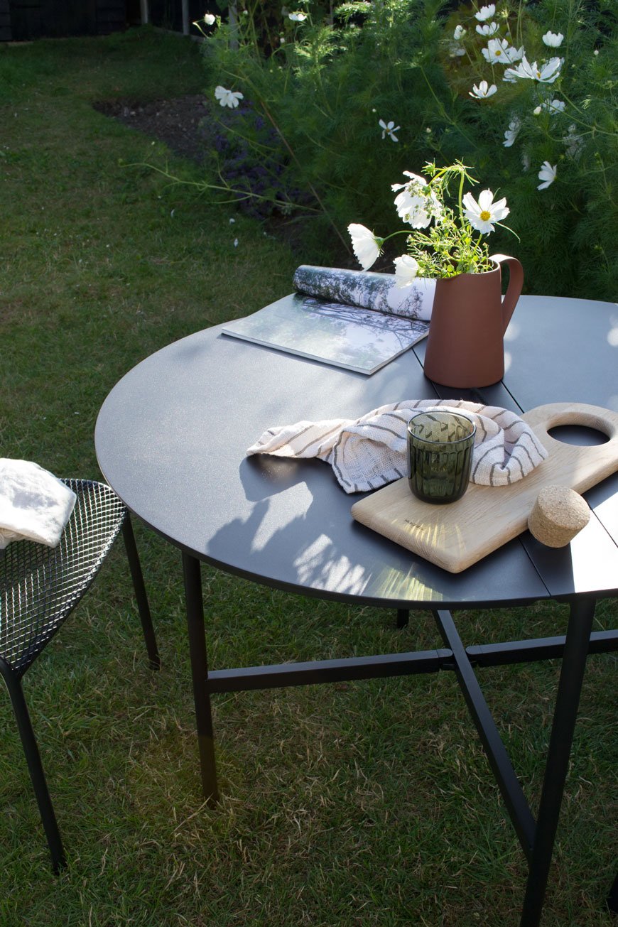
Before you start looking, think first how you want to use your garden. Do you want a permanent seating or dining area? Do you need space-saving furniture you can quickly fold away on your balcony? Once you've found the purpose, look to your furniture indoors to find a style that echos it.
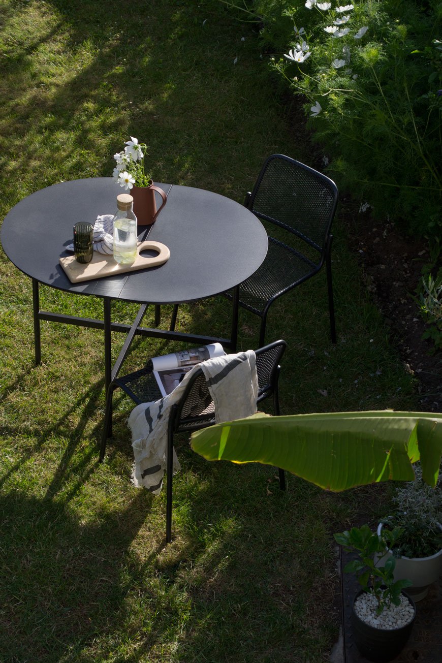
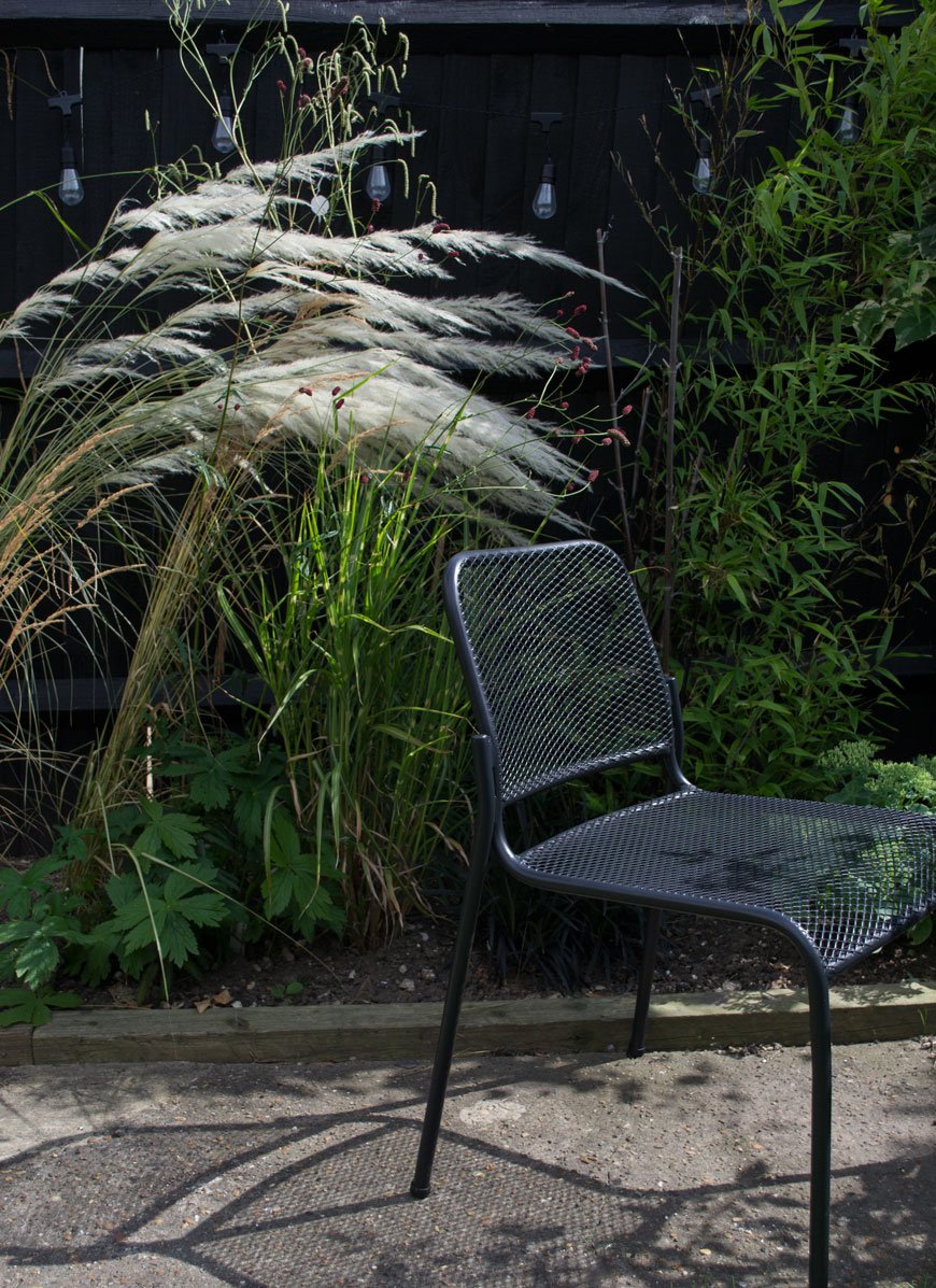
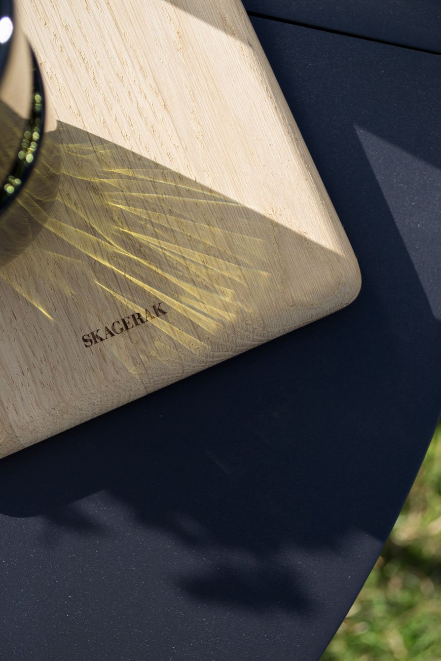
As we use the garden as a family, sharing some of it with a not-so-attractive trampoline (!) we needed something functional that could be folded and stacked away to accommodate water fights, camping in the garden and the like. The Picnic table, designed by Herman Studio for Skagerak is perfect for that purpose. Based on a classic folding leaf table, it's made in a lightweight aluminium with a carry handle on top to move it as you wish. Stools from the same collection stack easily and look great indoors too when we need a few extra seats around the dining table. Designed by Mia Lagerman, the stackable Mira chairs (set to be a future Skagerak classic if you ask me) throw down stark and striking shadows through steel mesh seats.
Layer The Light
Whether you use it to extend the amount of time you spend in the garden or simply to view it better from indoors, ambient lighting is essential. Outdoor lighting shows the garden from a completely different perspective at night and changes the way you experience it. Solar string lights are an update on a classic and you don't need to wire them into the mains to enjoy the warm glow in the evening.
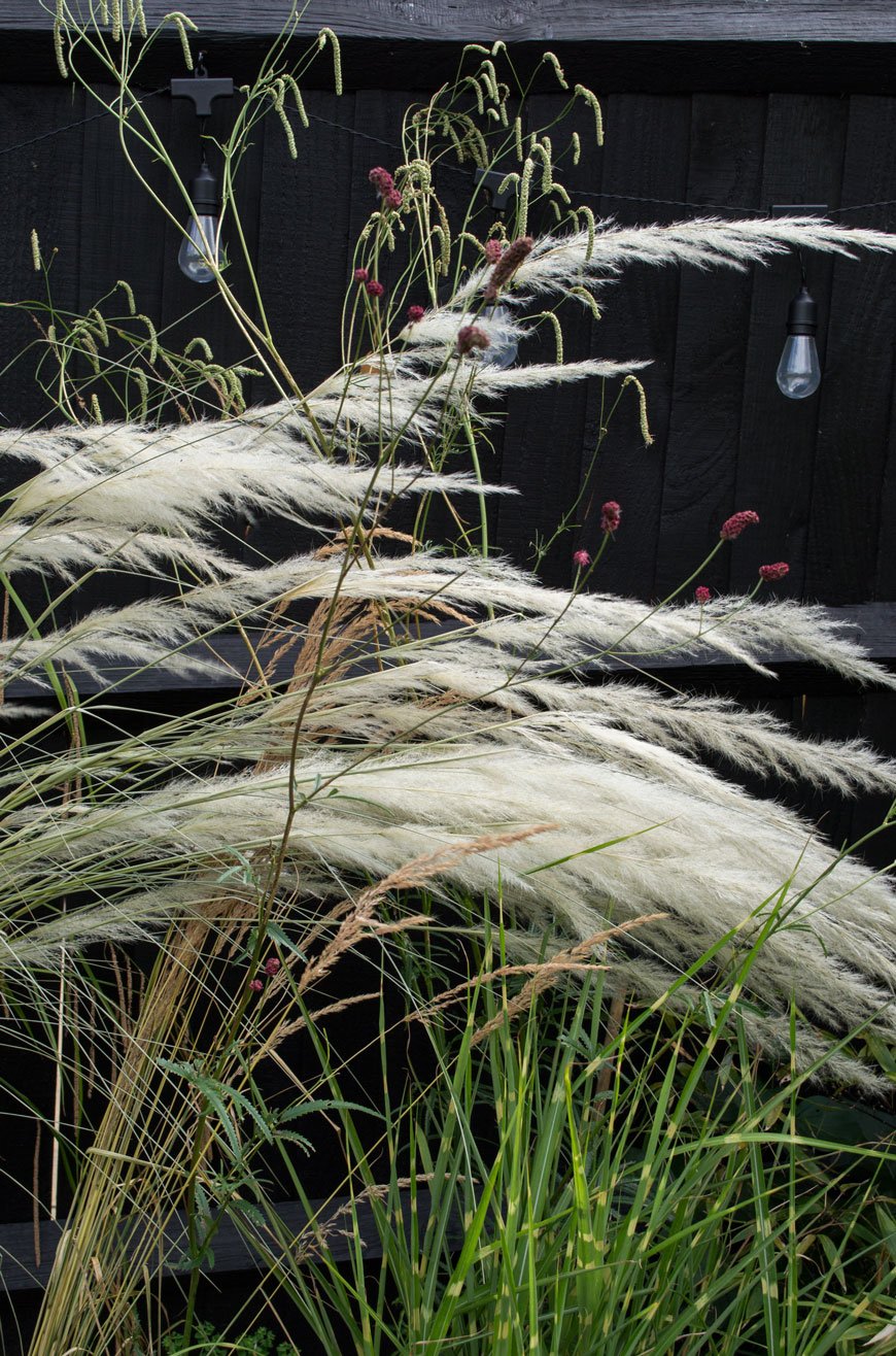
You can also use light to accentuate architectural details in your garden. Try solar spots dotted into your border to show off the shape of taller plants or bring a tree to life at night with subtle fairy lights. It can be a clever tool to show how to navigate through the garden at night, lighting your journey along the path to a lounge area as the destination. For more directional light when you're round the table together, use lanterns.
Grow Your Own
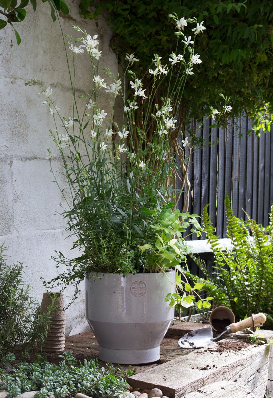
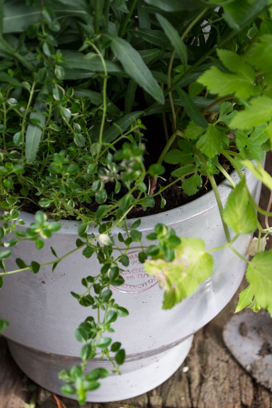
If you've yet to try growing your own, I highly recommend it. For one, the relaxation you get from sowing and nurturing plants is enough, but nothing beats the feeling of cooking and eating what you've grown. Using produce directly from the garden encourages you to head outside everyone once in a while and stay connected to the garden as it changes through the seasons.
You don't need huge amounts of space. A group of pots and a stretch of wall or trellis will allow you to grow vertically - great if you have a balcony. Pick easy to grow varieties of tomatoes, courgettes and berries to cultivate your own kitchen garden. Having a few well-stocked pots of herbs to hand by the back door is brilliant when you need a few sprigs for dinner too.
There we have it - how to make the garden feel more like an extension of your home. Summer may be a little long in the tooth now, but these tips will give you a strong foundation to help you bring your indoor and outdoor spaces together, whatever the season.
Photography and Styling © Tiffany Grant-Riley
Do You Have A Favourite Photograph Of Yourself?

Do you have a favourite photograph of yourself? An actual, physical photograph? I realise I might be leaving out some of the iphone generation here but, back in the day, we used to print our photos. I know you know that. But seriously, there's something special about a photo you can hold in your hand, even if you do just stash it away somewhere for another day. And they're one of the few things I would rescue from a burning building, too.
This is mine. 2002. Feeling grounded in the water. The summer before my 19th birthday, in which I spent almost every waking hour with my new friend Christian who I'd met not long before this way taken. We were introduced by a mutual friend I worked with at what was then the Radio 1 Roadshow in Ipswich. Between Natalie Imbruglia, cringing over B*Witched, sunscreen and swigging cheap beer, we began a tentative friendship. An aspiring photographer, he asked to take my photo. Me, desperate to leave the town behind, maybe to try modelling, agreed to let him - I would put them in a book and visit some agencies in London.
Over a few days, we drove around some of his favourite places and he snapped away as we talked, capturing all of my teenage uncertainty and nervous giggles, uncomfortable in my own skin. Except for this one.
This was me, six months into rebuilding my life after I had the rug pulled from under my feet. After my father had kicked me out and sent me back to mum, without explanation. His way of dealing with things. I had to start all over again. A-levels under a different syllabus, new friends, deferring uni. Dealing with rejection. But underneath that vulnerability, I see a glint of strength and a taste for adventure in that almost-smile.
And I want to grab her and hold her and tell her that everything will work out fine. That the path she'll take won't be the right one, but a step in the right direction. That she'll have to learn to open up, let go, forgive. Maybe spend less time chasing idiots at uni, oh-and don't go out the night before Notting Hill Carnival. I'd tell her that eight years from now, she'd reconnect with lost family and rebuild her Caribbean connections. And to trust the journey.
Photos are funny things. On the one hand, they have the ability to make the subject want to shrivel up with cringing, on the other, loved ones looking back at you see only the things they love about you. An imprint of you not yet knowing what you do now. I think we all have a favourite photograph of ourselves somewhere. Perhaps you love it because it's painful to look at? Or you weren't even aware of it being taken? It might not have been the happiest time, your most confident time, but maybe you connect with it because of where you are today, signifying a journey. Does it sum up a time you felt most content? Or does it include a loved one no longer around? Above everything else, it might even be more about the person taking that photograph and something in the way they see you through that lens.
So dig one out. Find one, even a digital one and make sure you print it and keep it close by. A little reminder of you. Even if you decide to stash it away for another day...
If these pictures have anything important to say to future generations, it's this...I was here! I existed! I was young, I was happy, and someone cared enough about me in this world...to take my picture.
-Robin Williams.
Japanordic Elegance From H&M Home A/W 19
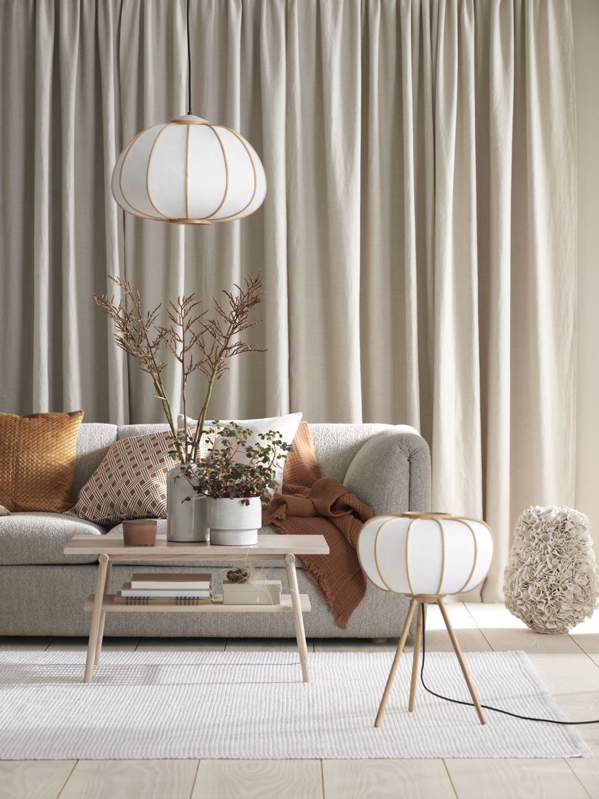 It's a quick despatch from me today, as I write from a swelteringly sunny Chatham.I'm really quite fond of H&M Home. Whilst I'm not in the habit of updating our home too often, it's brilliant for sourcing details and finishing touches, especially when you don't want to resort to the ever-popular Swedish flatpack store.Since launching a line of lighting and furniture last year, they've been going from strength to strength. The styling, courtesy of Tina Hellberg and Therese Sennerholt is literally too good not to share. I mean look at it.So, we may be bang in the midst of summer but here I am, sharing the latest additions to the H&M Home Autumn/Winter collection for 2019.
 Following my recent post from Copenhagen in which Japanese culture and design were a common thread, this collection beautifully combines both Nordic and Japanese aesthetics. In this case, 'Japanordic' is an appropriate description of this style. And trust me, you'll be seeing more of it in the coming years. Nordic Minimalism is not dead, it's just becoming softer and warmer with a crafted, Japanese influence.
 Soothing, sandy hues are a nod to the transitional phase as Summer turns to Autumn. Rich tones of cinnamon and burnt orange are woven through the textiles. Natural materials are left to shine in their rawest form. The collection features Ash wood benches, rattan storage, paper lighting and mango wood tables. And of course, I absolutely love the tone-on-tone styling which suggests a return to a cosy and cocooning home.
 So we should really talk about the rattan planter and cabinet because, in my opinion, these are the heroes of the whole collection. An extension of the Safari range, they make for versatile pieces that would suit most interiors. Dark wood frames suggest a move away from the paler Scandinavian style and sustainable, woven rattan gives them an artisanal feel. And I love that you can store things other than plants inside them.
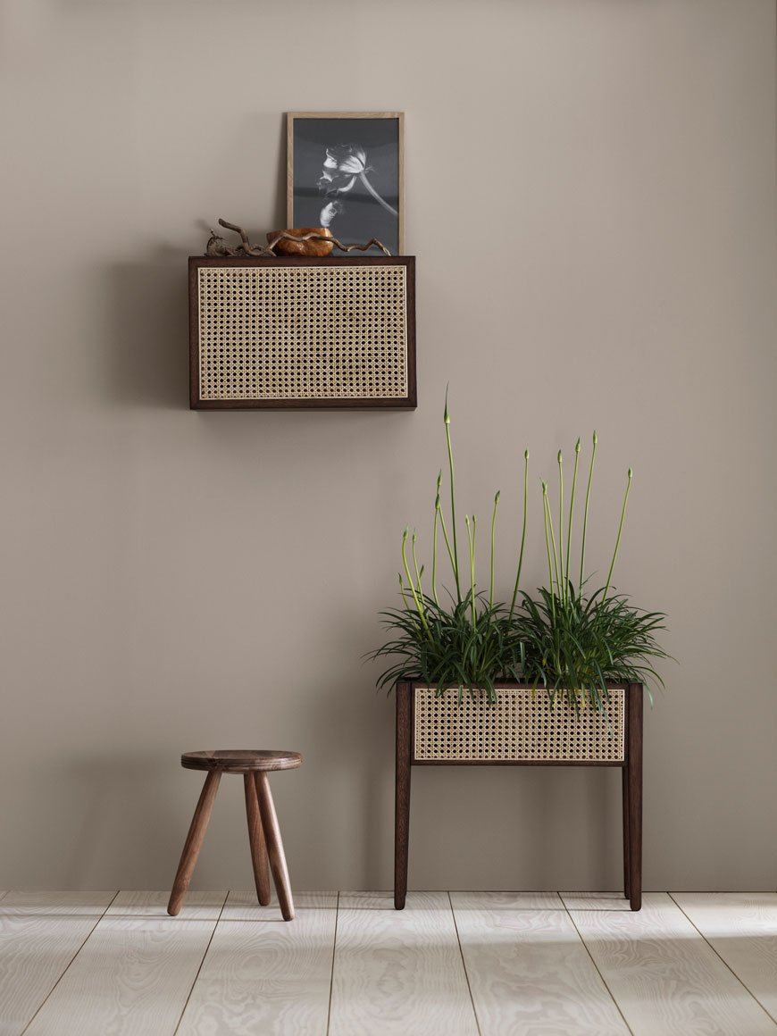
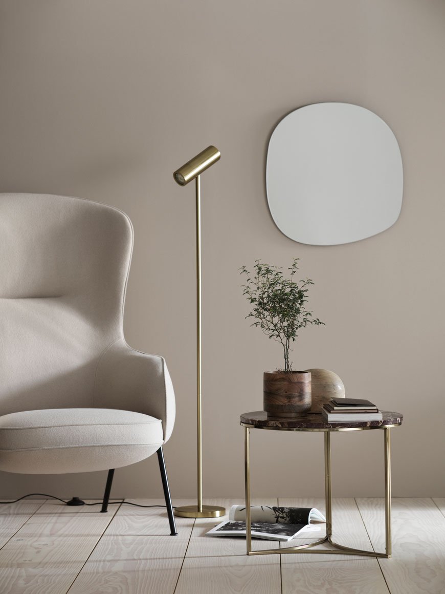 As is typical with Japanordic style, the focus is on the quality and form of the key pieces, with an uncluttered, considered interior to set it off.Cherry marble and polished brass bring a sense of luxury, toned down with uncomplicated, clean lines. Organic shapes are echoed in mirrors and opaque glass lamps, inspired by the Lily of The Valley. There are so many individual pieces you could take away and make work in your own home, too.
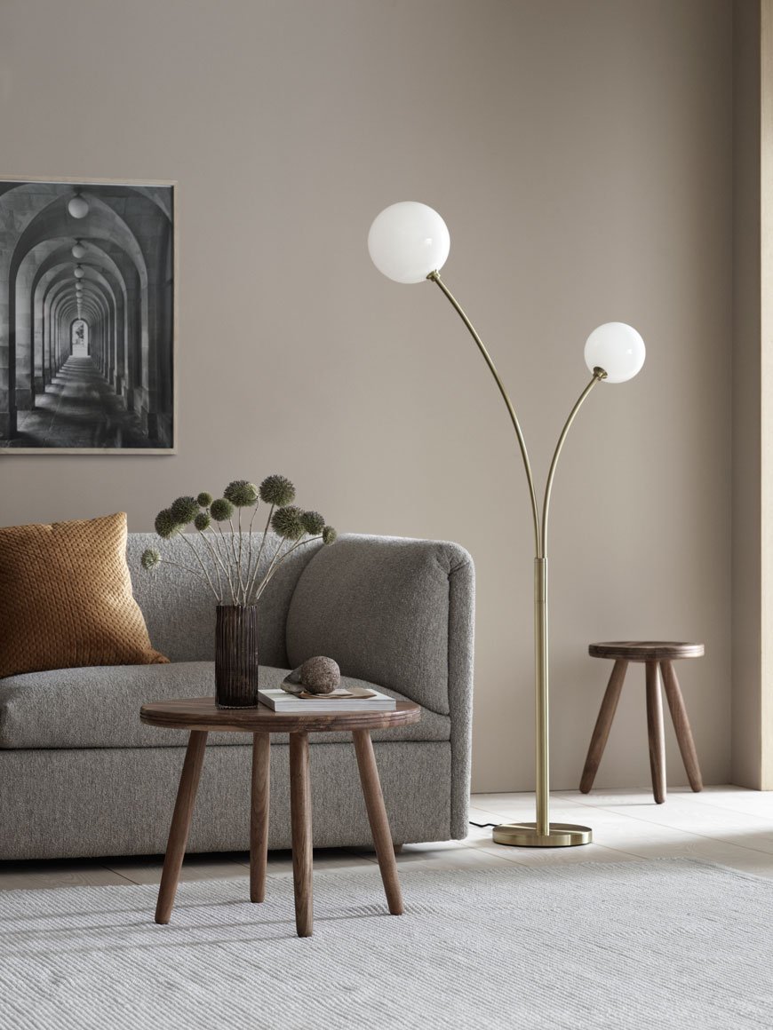
 Well, I'm excited. Keep your eyes peeled for these new releases in the coming weeks.
Photography by Ragnar Ómarsson for H&M Home.
A Secluded Stay In Vanellus At Elmley Nature Reserve
 On the rare occasion that I have the chance to book a night away, I never think to look a mere 30-minute drive from our house. Living in Kent we're always spoilt by the close proximity of the countryside and coast, but picky as I am, I tend to find stylish stays a little wanting.And yet. A stay at Elmley Nature Reserve has been at the very top of my list for the longest time. I would hold on to it like a mantra, the idea of escaping and disappearing out into the yonder of its wilderness at times when life was getting a bit too much. Nothing but great swathes of open sky and marshes. What greater feeling than to steal yourself away in total seclusion and get back to basics?! So it was a wonderful surprise to receive the gift of a stay for my birthday from my sister and parents, who clearly know me too well.A completely off-grid experience in every sense of the word, Kingshill is a family run working farm which generates its own electricity. Nestled in the bosom of a 3,200-acre estate on an island in the Thames, you couldn't get any further away from the hustle and bustle of things even with Sheppey a stone's throw away. An ideal spot to take in the wildlife across Elmley, the farm is host to a cluster of self-contained shepherd's huts, designed and built by Plankbridge.
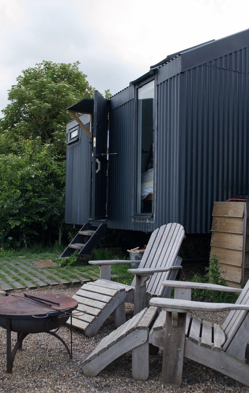 Set further back from the other huts on the reserve in a space entirely all its own, we arrived at Vanellus. Oozing with modern rustic style with all mod-cons, I felt the tension lift instantly. With an irresistibly comfy kingsize bed looking out at a floor to ceiling view out of the marshes, you surrender yourself to the surroundings. The first thing that hits you is the sound, a symphony of marshland birds and lowing cattle across the field. It almost lulls you to sleep. Though that may be a challenge with views like this. You'll find yourself doing a lot of staring here. It's impossible not to. Had the morning been clearer the following day we'd have woken early to watch the sunrise. But there's always another time.
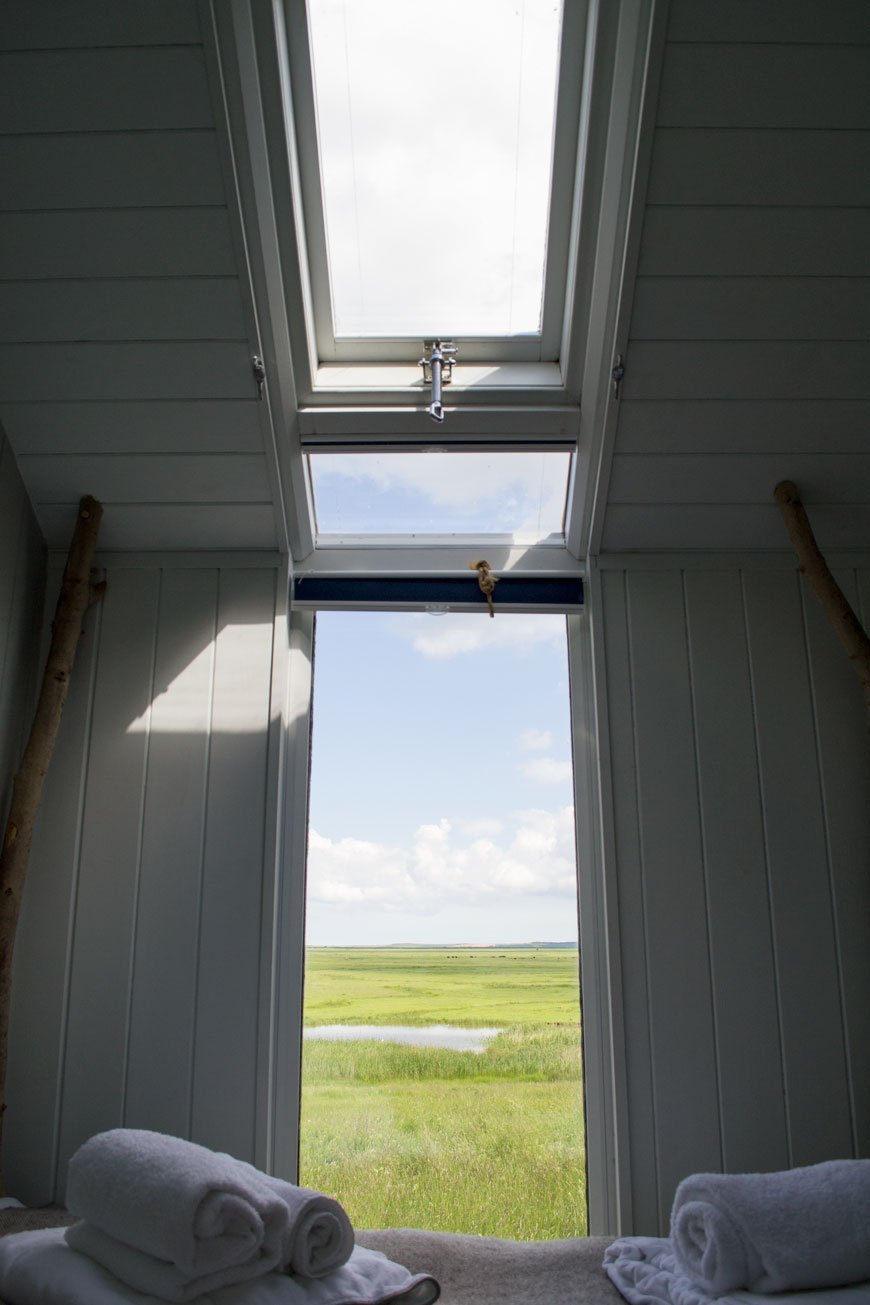
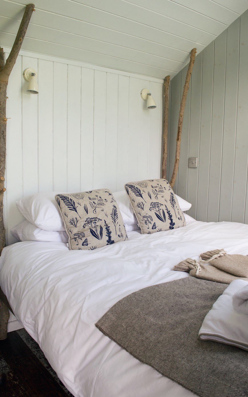
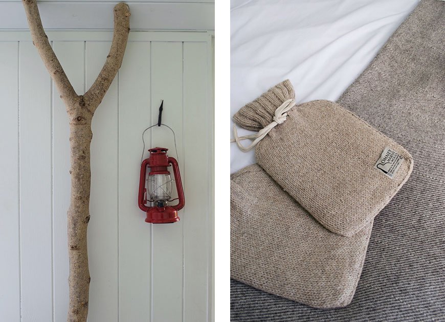 Every square inch of the hut has been carefully considered - this is tiny house living but not a way that feels cramped or lacking. A sweet little dresser made from an old railway wagon creates a kitchen, folding chairs and a table give you a dining area when you need it and there's a fully functioning en-suite shower and toilet too. Hidden inside a small cupboard, we found a gas burner for making coffee with a larger hob out back for cooking meals alfresco and my favourite touch, a mini fridge which we stocked up with strawberries and prosecco.
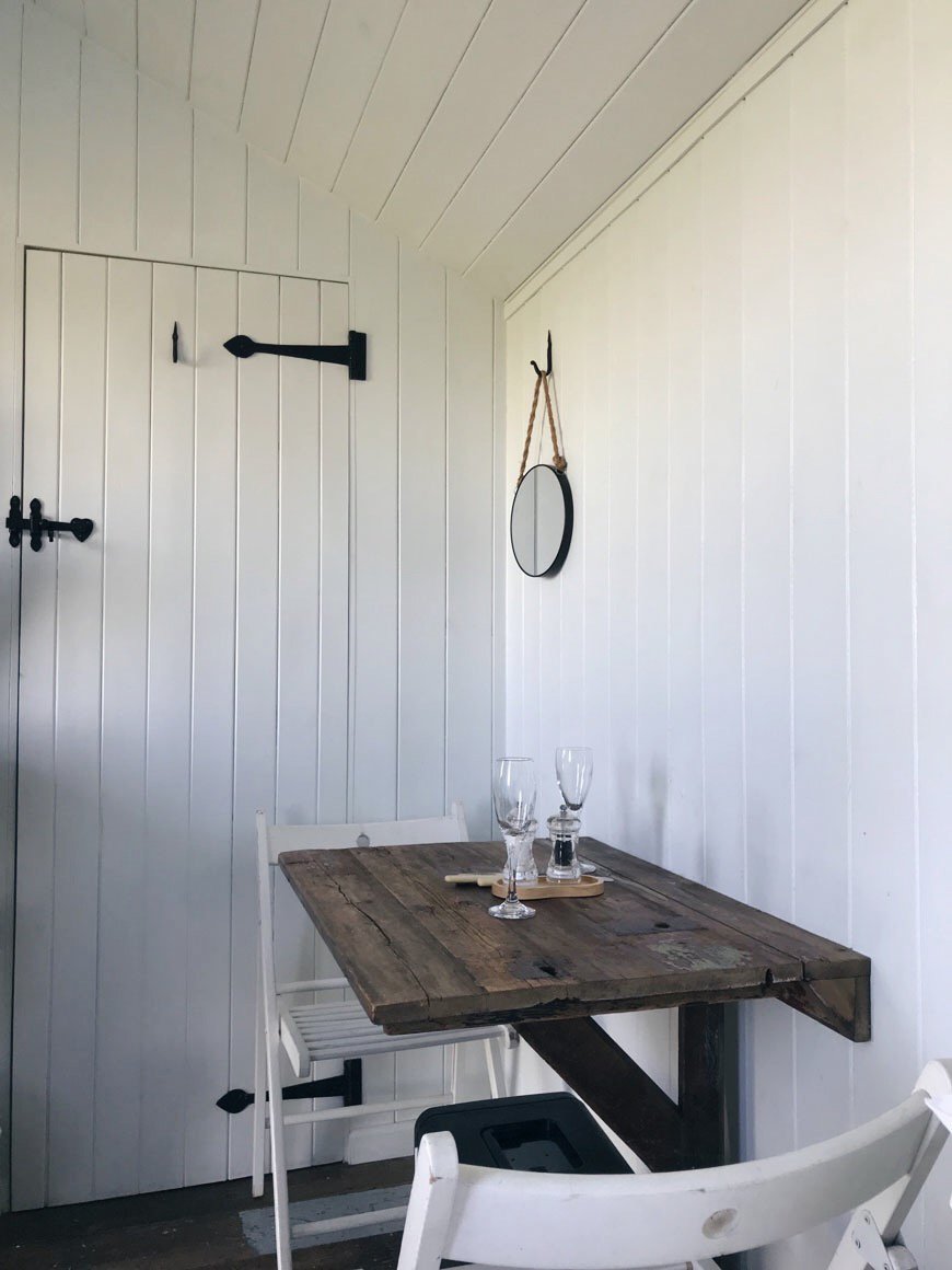
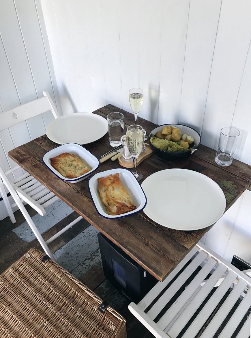 With a home cooked dinner being delivered to our hut later, we headed out to explore the reserve. There are miles of walking to be done with more time, taking you out to the Spitend Hide if you've got the determination to make the three-mile hike. The team at Elmley even keep a code protected treat box stocked with gin to celebrate when you reach the point, but it was enough for us to find the first hide and watch the avocets for a while. Maybe next time.
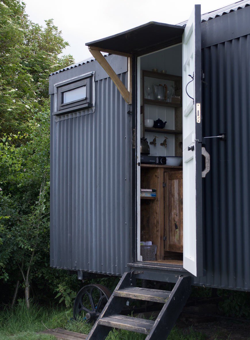


 I took my sketchbook with the hope of getting some practice in (I did) and loved being able to concentrate on just drawing for a while. During our stay, we spotted a number of peewits, goldfinches, falcons, egrets and hares. At sunset, as we sat watching the sky turn to candy pink by the firepit, a barn owl swooped past. I mean, wow.If this doesn't make you want to book a visit now, I don't know what will. And if you'd just like to soak up the atmosphere and walk the reserve, you can access the trails between 9am - 5pm (closed on Tuesdays). Elmley, we will be back, perhaps for a cozy winter stay.Elmley Nature Reserve, Elmley, Isle of Sheppey, Kent, ME12 3RW.


Photography © Tiffany Grant-Riley
[AD] Midsummer with the Bernadotte Collection by Georg Jensen
[This post is part of a paid partnership with Georg Jensen. Products were loaned for the purpose of this post.]
Of all the designs that span the Georg Jensen tableware collection, my favourite has to be the Bernadotte. With its clean, elegant lines and minimalist aesthetic, you'd be forgiven for assuming that this collection was new. It was, in fact, designed in 1931 by Swedish Prince Sigvard Bernadotte and has over time become a Scandinavian classic.His journey in design began at the Royal Swedish Academy of Fine Arts in 1929. Nicknamed 'The Design Prince', Bernadotte would make a name for himself as a pioneer of industrial design at a time when the style was beginning to move away from the ornate.During a visit to the 1930 Stockholm Exhibition, he was introduced to the work of architect Gunnar Asplund whose move towards stripped-back functionality within architecture would lay the foundations for Modernism and minimalism. Favouring practicality over opulence, functionalist architecture would centre around modular structures with a focus on the raw building materials, flat roofing and lots of glass. Driven by the idea of building for a better world, the functionalist movement would put the user at the centre of the experience, doing away with unnecessary beautification.Inspired by these ideals, Bernadotte would go on to form an alliance with Georg Jensen. Continuing on from the brand's traditional Art Nouveau style, his new era of functionalism would direct Georg Jensen towards more modern interpretations of silverware.
 I shot the collection the day the weather broke, after almost a solid week of torrential rain. In June! With midsummer almost upon us, I felt a little Nordic inspired celebration was in order. Sitting on top of the Serving Plate is a ridiculously moist orange, almond and ricotta cake I baked the night before. It's a no flour sponge which makes it a perfect summer accompaniment for a light afternoon tea. And with a freshly brewed Thermo of coffee, I watched the afternoon sunlight play with the ripples in the steel.The vase is a real statement piece in its own right but I chose to create a free-form display of wild and garden flowers to show off its sculptural appeal. All the hard work I've put into our white garden is slowing revealing itself as the summer rolls on and I wanted to document some of the blooms I'm most proud of. The white 'Royal Wedding' poppy, cut from my garden along with the white astrantia I thought was a fitting connection to Bernadotte's royal heritage. Other wild additions picked from the meadow behind our house include barely open bramble flowers, geum seed heads, Queen Anne's Lace and grasses.Simple and free.

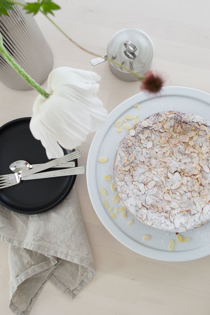
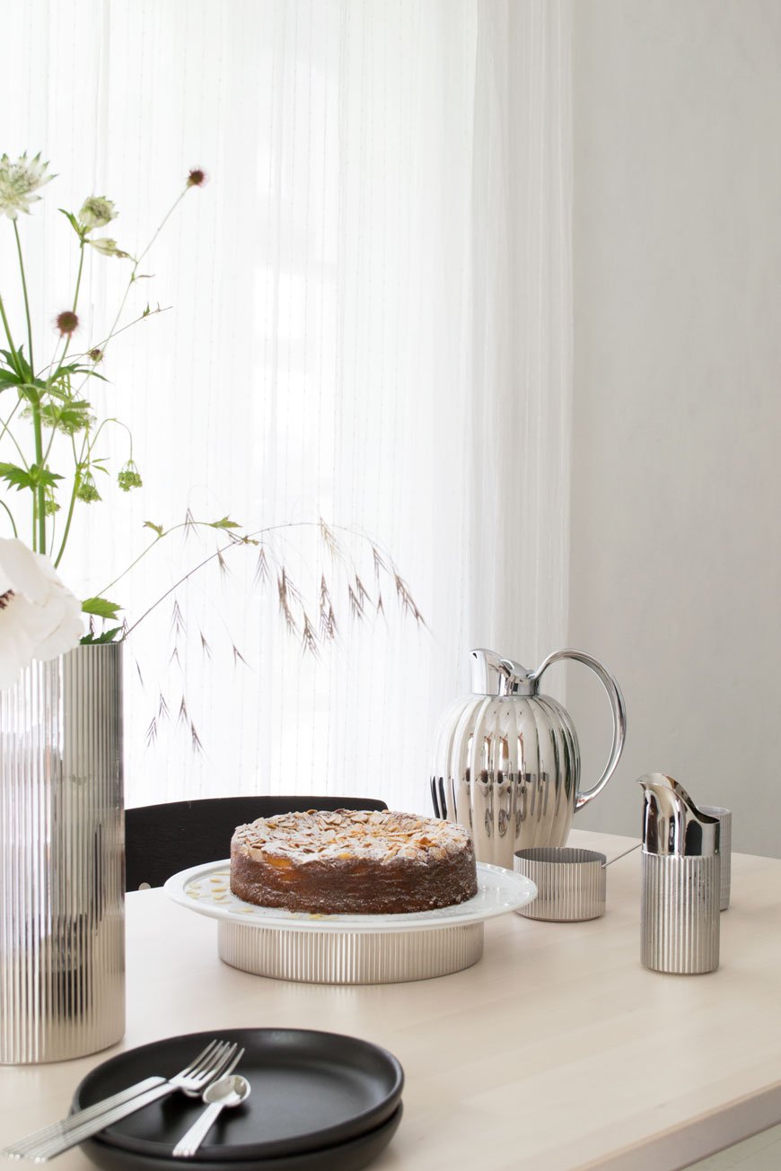
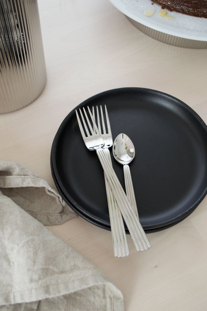
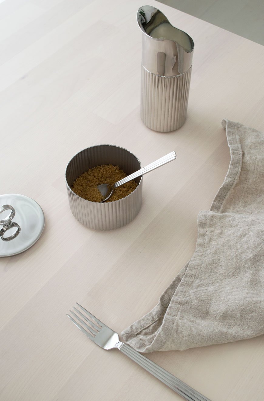
 Serving Plate, £160 | Large Vase, £120 | Sugar Bowl and Spoon, £75 | Thermos, £195 | Creamer / Milk Jug, £65 | Luncheon Fork, £180 | Small Teaspoon, £100.
Photography & Styling © Tiffany Grant-Riley
 Would you like to win a Bernadotte coffee and tea set? Georg Jensen is hosting a competition:"Enjoy tea time in style with our classic Bernadotte designs in refined stainless steel. We’re giving away our large Bernadotte thermo as well as the new Bernadotte creamer and sugar bowl to a lucky winner – and that could be you. Simply sign up to receive our Georg Jensen newsletters to enter. The competition will run until 15 July 2019 and the winner will be contacted via email.*"https://www.georgjensen.com/global/bernadotte-competition* Please note - be sure to check 'NO THANKS' when clicking the link above to be redirected to the competition page. Terms and conditions apply. Good luck!